ATLAS TYPEWRITER
How this microsite works
Atlas
Designed by Kai Bernau and Susana Carvalho with Christian Schwartz, Atlas was originally designed as a corporate typeface for Munich Re, one of the world’s largest reinsurance companies. While the typeface needed to communicate the tone and personality of the company, a more concrete part of the brief was to save space, and in doing so, save paper in the hundreds of reports that Munich Re issues each year. Atlas Grotesk accomplished this by having relatively long ascenders but short descenders, allowing the typeface to feel spacious and comfortable for extended reading even when set with tight leading.
The aesthetic of Atlas Grotesk was inspired in large part by the sans serifs of the 1950s, specifically Dick Dooijes’s Mercator, released by the Amsterdam Type Foundry in 1957. However, while Atlas takes most of its stylistic cues from Europe, its vertical proportions and contrast have more in common with American gothics, and it sets more like Trade Gothic or Franklin Gothic than like Neue Haas Grotesk or Univers.
Atlas Grotesk is a quintessential example of a typeface that does whatever a graphic or web designer needs it to, from expressive magazine covers to quiet, pristine layouts hearkening back to International Modernism. This chameleon-like functionalism is probably why it is one of our most popular webfonts, working equally well for small furniture studios and major news sites. Its simplicity is tempered by details like the tail on the a and the top of the t, which humanize the typeface and give it warmth.
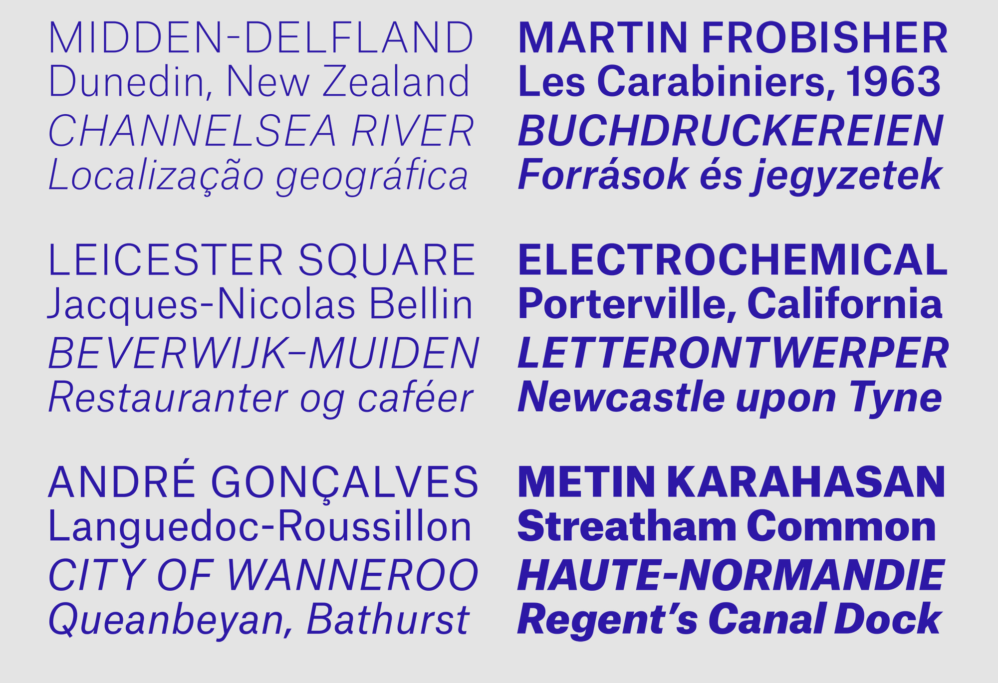
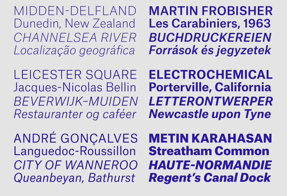 Atlas Grotesk has 6 weights. Its proportion is compact in both directions, allowing for tight leading and also fitting more characters per line.
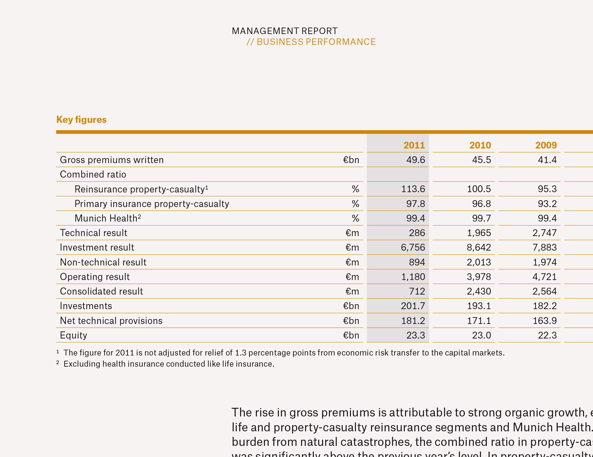
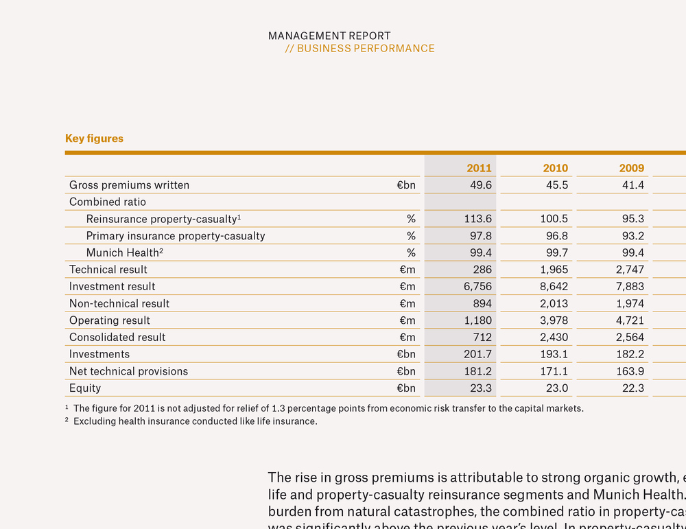 This excerpt from one of Munich Re's annual reports shows Atlas Grotesk in its original context.
Atlas Typewriter came about because Carvalho and Bernau were interested to see how these forms could adapt to monospaced proportions, as it seemed like a logical extension for such a functional family. Keeping a distinctive personality while solving the spatial problems of a monospaced typeface is not easy. In effect, it all comes down to how the designers balance the widest characters, such as M W m and w, with narrow characters like I J f i j l r t and 1. Carvalho and Bernau decided to make the f and t distinctively symmetrical, while the r is unadorned with extraneous serifs or terminals, making it neater and less distracting in text than it is in most monospaced san serifs. The two families work hand in hand when used together, but each also combines well with other typefaces. Atlas Typewriter is an excellent augmentary typeface for data and code. As the length of a piece of text doesn’t change with differing weights, it also works well for navigational elements that become bolder on rollover.
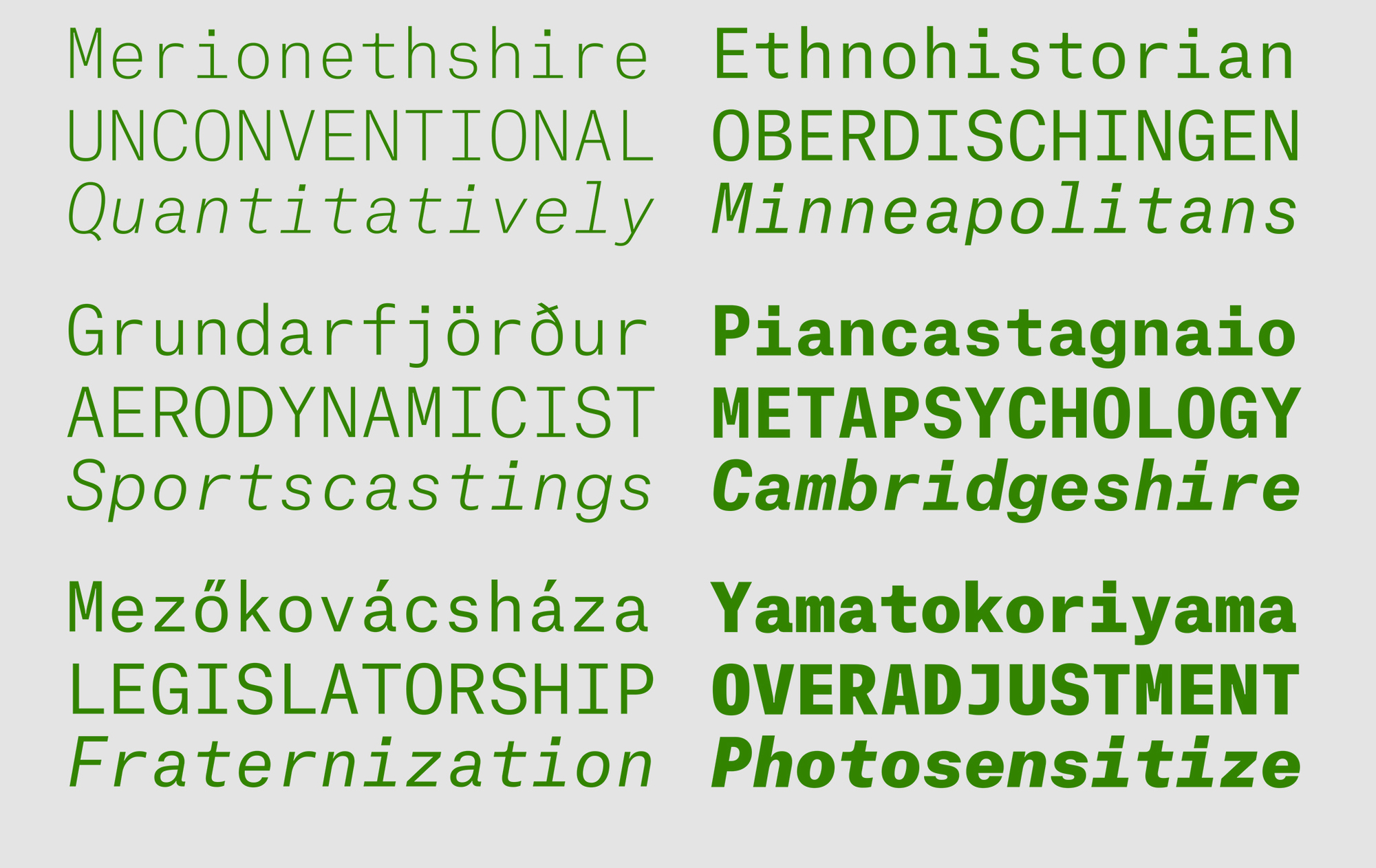
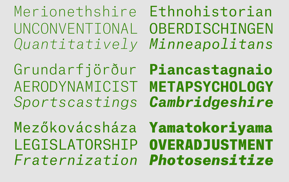 Atlas Typewriter has a very even texture for a monospaced sans.
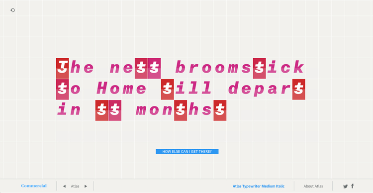
We limit the displayed glyphs to alphanumerics and 12 additional glyphs, similar to what one would find in a flipboard display in a train station. The text to be displayed is stored in a matrix representing the flipboard grid, with each character represented by its index in the array of allowed glyphs. Each cell of the flipboard consists of two containers, one for the upper portion of the glyph, one for the bottom. To display the text we increment the displayed glyph in each cell to the one that is to be displayed, so ‘Z‘ takes longer to appear than ‘a’. Slight color variations between the top and bottom portion of each cell as well as the speed of the animation give the appearance of a flipboard.