AUSTIN HAIRLINE
AUSTIN TEXT
How this microsite works
Austin
Austin is a loose revival of the typefaces of Richard Austin of the late 18th century for the publisher John Bell. Working as a trade engraver Austin cut the first British modern and later the iconoclastic Scotch Roman. While Austin Text is relatively faithful to Austin's types, Austin and Austin Hairline bring in 20th century influences for a fresh new display look.
Paul Barnes drew the Austin family for Harpers & Queen magazine when Sheila Jack was creative director. Paul knew that the magazine needed a high-contrast ‘fashion’ typeface, but he saw potential to make something more distinctive and unexpected than the ubiquitous Didot. The types of Austin seemed to have great potential for interpretation. Less sharp than the British Moderns, with bracketed serifs and smooth connections between thin strokes and ball terminals, the shapes took on a slick elegance as the contrast increased. Paul fully embraced this, giving Austin the styling and sheen of 1970s advertising types, decribing the result as “Richard Austin meets Tony Stan, a British Modern as seen through the lens of 1970s New York.”
Austin is compact without being overtly condensed, allowing for longer headlines in narrower spaces that manage not to feel cramped. The extensive weight range manages to retain its elegance regardless of how heavy it gets. The extremes of the family, the Light and Ultra weights, were drawn by Berton Hasebe.
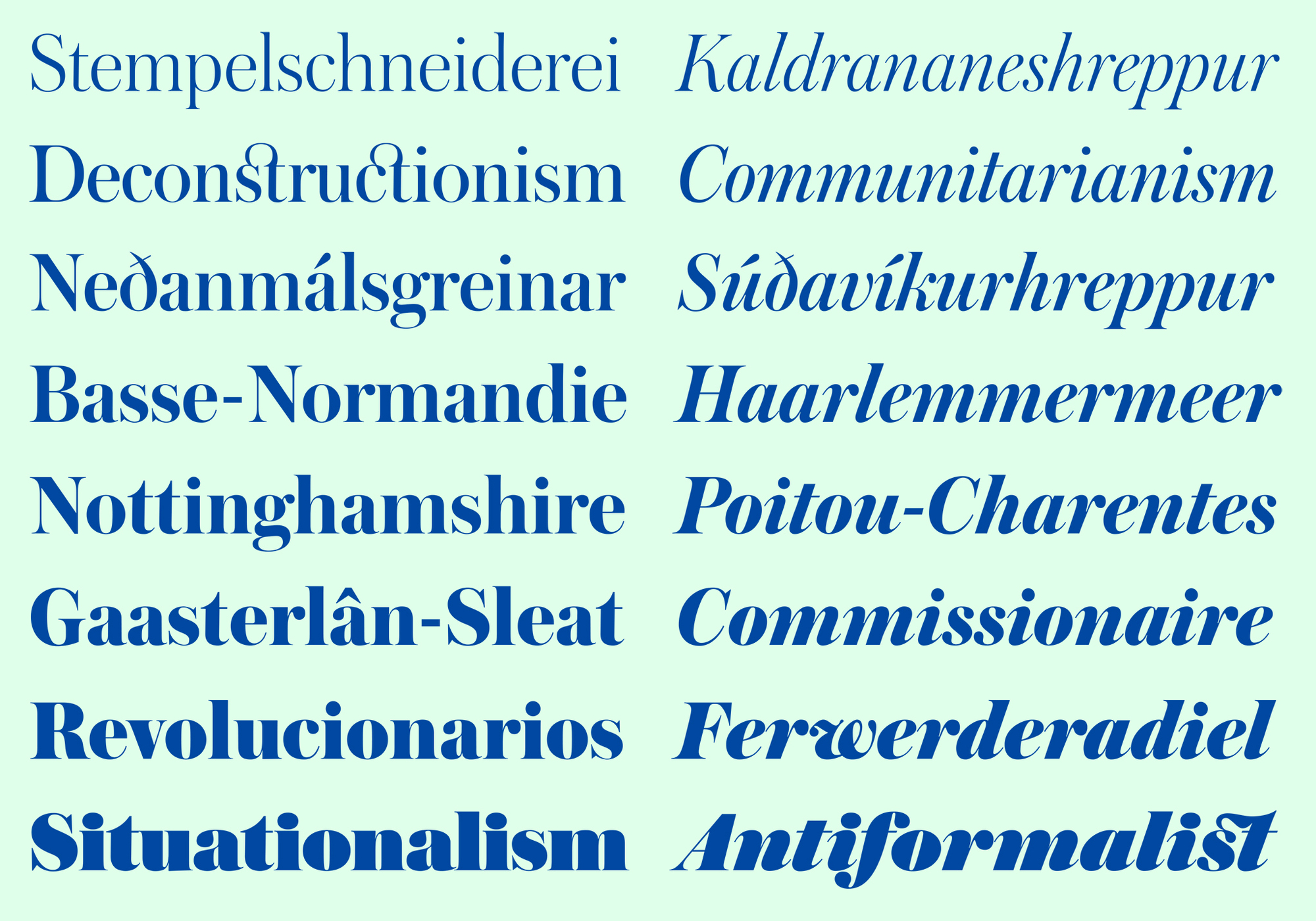
 The Austin family is comprised of eight weights.
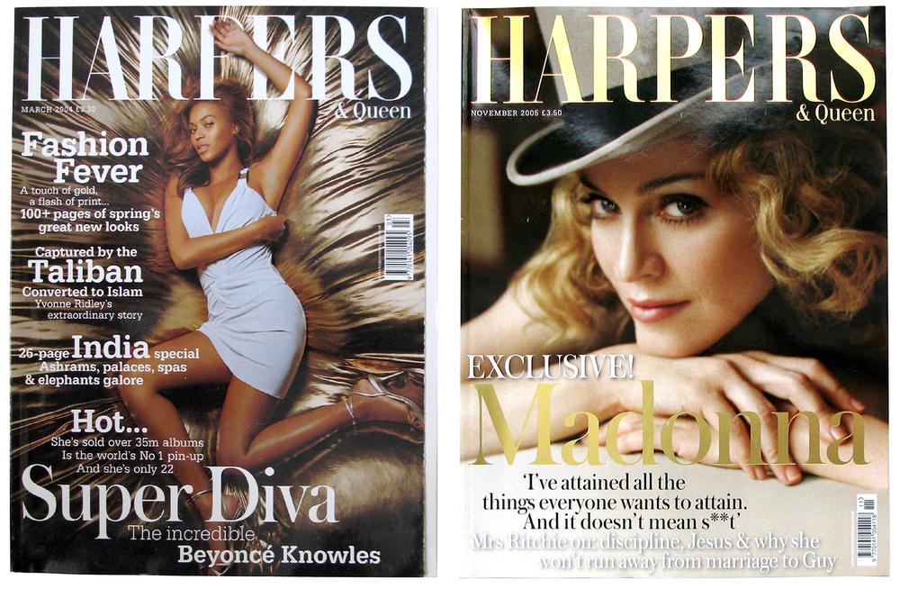 Harpers & Queen used Austin as their primary headline face for several years.
Berton Hasebe drew Austin Hairline for Alex Grossman at WSJ magazine, where it was used for enormous headlines and page-filling drop caps. It hairlines are too delicate to be practical on the web, so it is only available for use on the desktop.
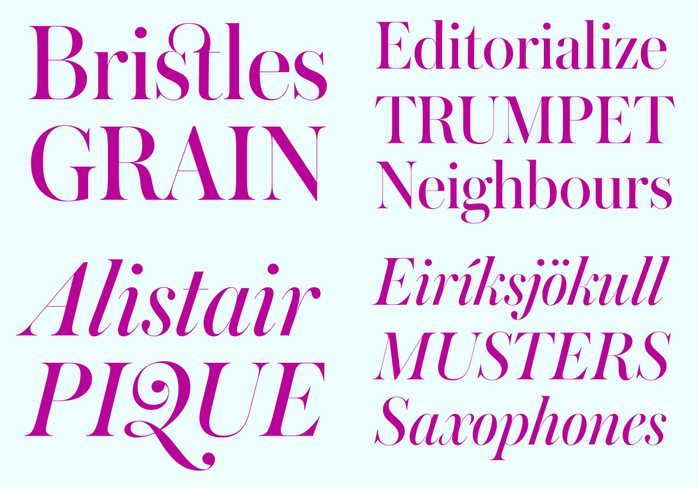
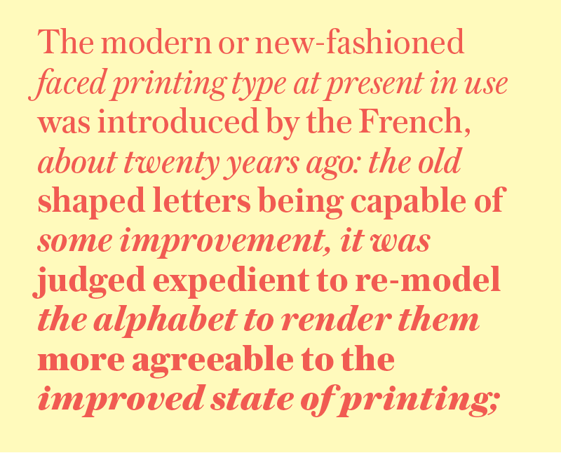
Austin Text is a highly personable text face firmly in the English tradition. While Austin has a narrow proportion, Austin Text matches the comfortable proportions of Austin’s text faces and the elegance of his italics. On screen, Austin Text can effectively work as both a text face and a display face.
 The five weights of Austin Text allow this family to be used for a wide range of applications.
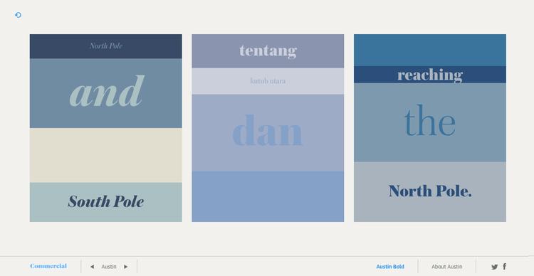
We use Google’s search API to perform an image search for the text entered by the user. We use the thumbnails of the top 6 results, along with text from the corresponding search result summaries, to generate the poster layouts. The colorspace of each image is quantized to a four-color palette. These colors are combined with words extracted from the search result summary for the image. The text strips are randomly assigned one of three point sizes, placed into random stripe heights, and the colors are applied randomly to the text and backgrounds. The randomness is controlled by two rules: only one stripe per layout can be blank, and the same color may not be used for the text and background in the same stripe.