CAPONI DISPLAY
CAPONI TEXT
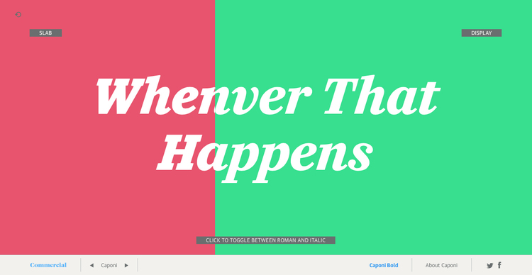
How this microsite works
Caponi
Most contemporary revivals of Giambattista Bodoni’s work have focused almost entirely on the elegant, high-contrast types that he cut in the early part of the nineteenth century. Caponi, named for the late Amid Capeci, who commissioned it for his twentieth anniversary revamp of Entertainment Weekly, expands the notion of what Bodoni’s work was. It draws in part on his later work, but takes as its primary reference the typefaces he cut during the early years of his career, when he had been greatly influenced by the Rococco style of the French printer and punchcutter Pierre Simon Fournier. The three families of Caponi each play a different role while complementing each other.
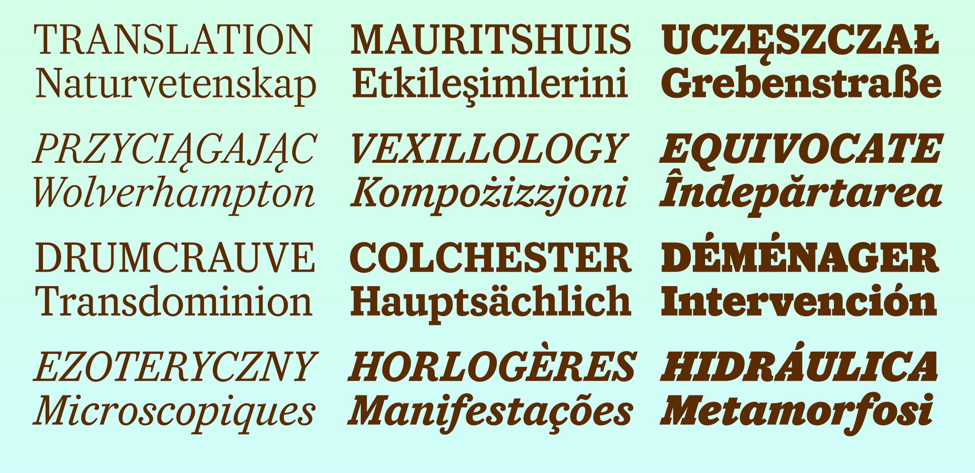
Caponi Slab was first designed for headline use in Entertainment Weekly. A wide range of topics could potentially end up on the cover of the magazine from week to week, from high-minded Oscar movies, to controversial pop stars, to gleefully trashy reality television, so the family needed to cover many tones in one cohesive range of weights. The solution was a spectrum from elegance to exuberance: the lightest weights clearly show their origin in Bodoni’s work, but the family transforms into a boisterous slab serif as it gains weight. Caponi Slab’s short ascenders and descenders allow it to work with tight leading, and its low contrast helps it to hold its own on the page no matter the size.
 Caponi Slab has a wide range of tones across its six weights.
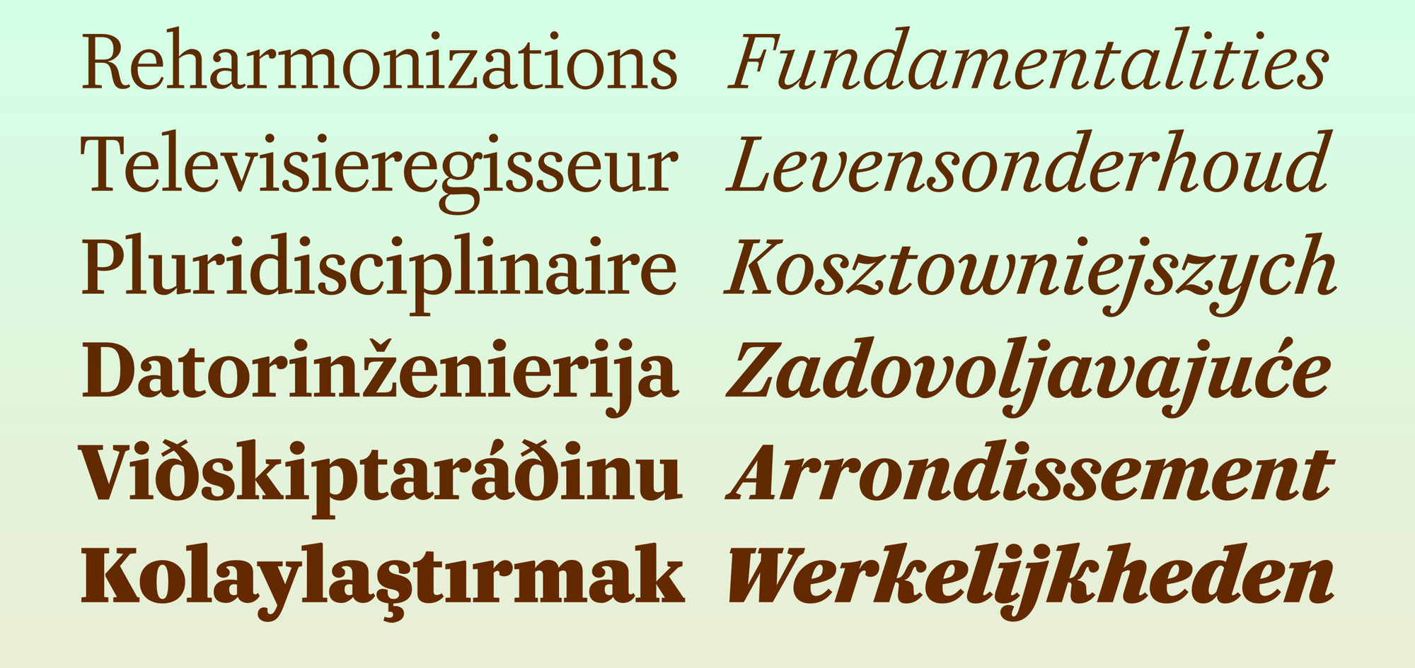
Caponi Display and Caponi Slab are similar in their lightest weights, but depart quickly into two very different approaches to weight and contrast. Though lower contrast than other contemporary Bodoni revivals, Caponi Display follows Bodoni’s approach to weight and contrast, with long, elegant ascenders and descenders.
 Caponi Display is more faithful to its high-contrast origins than Caponi Slab is.
 Caponi Display (top) has longer ascenders and descenders, while Caponi Slab (below) is more compact, in addition to its lower contrast.
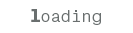
While Caponi was initially designed for display use in Entertainment Weekly, the primary source was Bodoni’s text types, making the later addition of a text version a logical idea. Caponi Text is unusual among contemporary interpretations of Bodoni not just in focusing on Bodoni’s earliest work, but also in fully embracing the inconsistencies and unevenness of the source material. The warm, inviting tone of Caponi Text expands the notion of how a Bodoni can feel on the page. While preserving many eccentricities, it also make concessions to contemporary taste, so a more traditional lowercase s, with serifs rather than ball terminals, is available as an alternate.
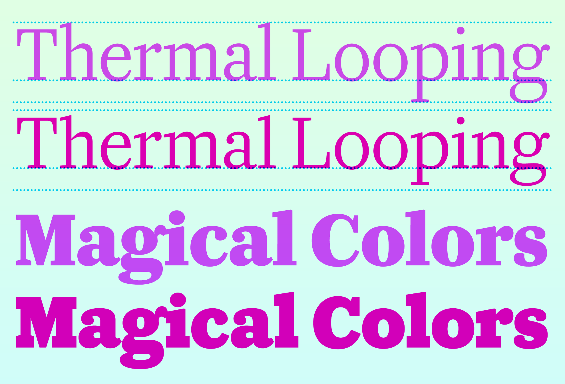
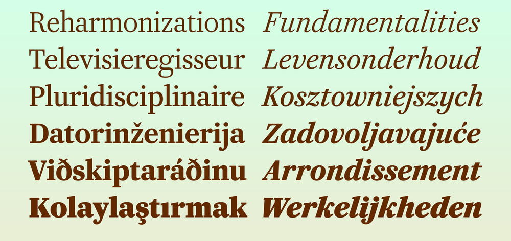
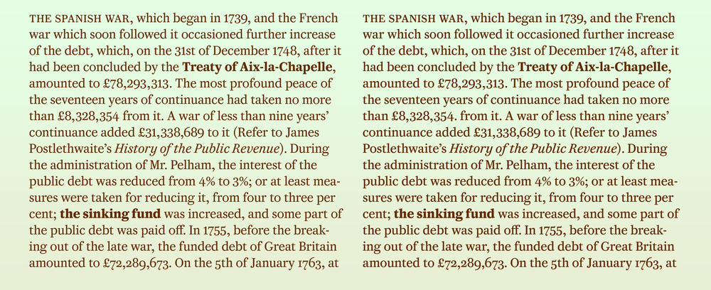 Like many of our text faces, Caponi Text includes both Regular (left) and a slightly heavier Regular No. 2 (right), useful for different applications and for different tastes.
Left and right are divided into separate containers, with the dividing line moving back and forth on the horizontal axis, proportional to the overall line length and controlled by the horizontal position of the mouse in the browser viewport. On the vertical axis, the canvas has been divided into six different zones to correspond with the different weights. We use standard input fields for text entry.