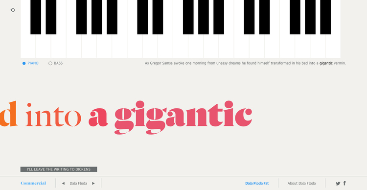
PIANO
BASS
WRITE TEXT:
SUBMIT
I'LL LEAVE THE WRITING TO
PLAY TEXT
REPLAY

Dala Floda and Dala Moa have their origins in the typefaces of the Renaissance, but in the unexpected form of a stencil.—and in the case of Dala Moa, a sans serif. Inspired by the worn letters on gravestones and lettering on shipping crates, the elegance of the forms belies their everyday origins. The stencil forms make both families very distinctive for headline use and especially well suited for logotypes.
First drawn in 1997 for a logo, Dala Floda eventually became the headline typeface for the art magazine frieze through most of the 00’s. Since then the family has grown considerably, with the addition of an italic and a range of heavier weights, all the way up to a Fat. Whereas a typeface like Graphik or Atlas politely does whatever a graphic designer asks of it, Dala Floda has an assertive personality that lets graphic designers sit back and do very little. The typeface does the work of making a magazine spread, poster, book cover, or webpage look interesting and distinctive.
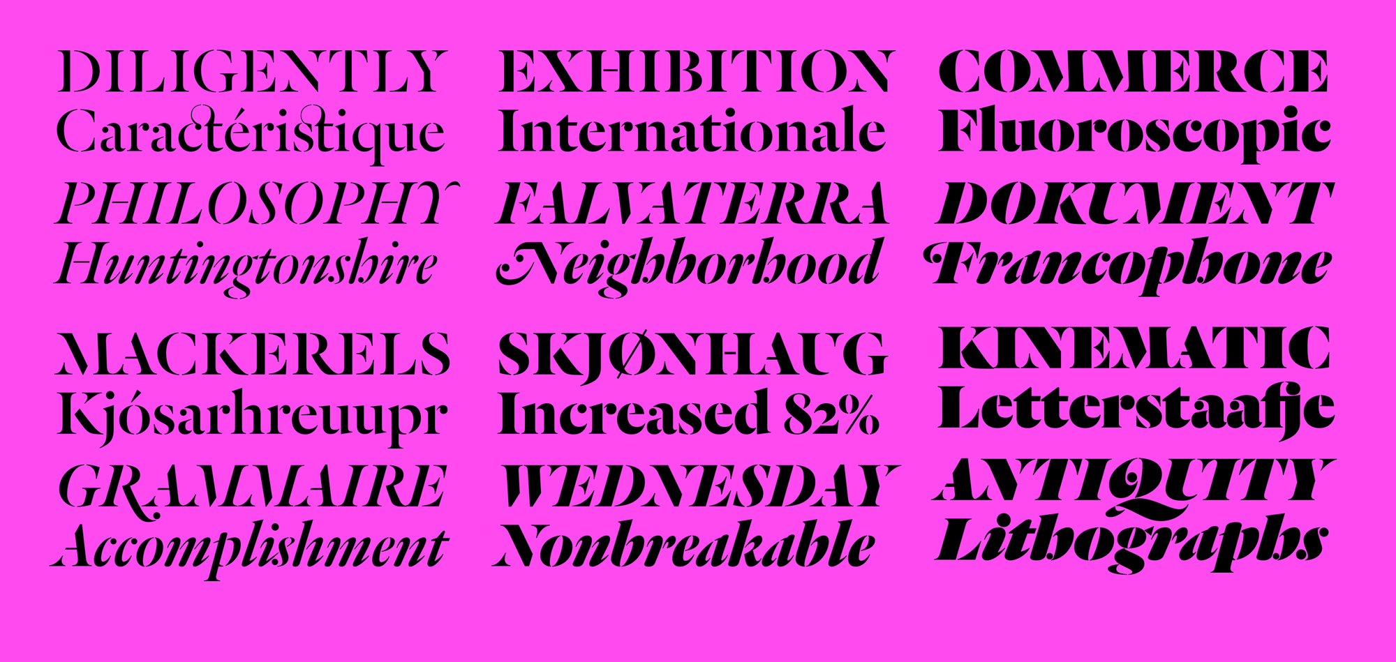
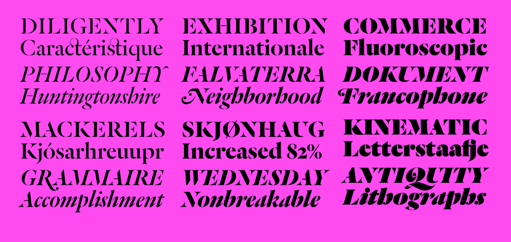 Dala Floda remains elegant through its entire range of weights.
Dala Floda's expressive nature is further renhanced by an extensive set of swashes in all italic weights. Because browsers still haven't consistently implemented access for OTF layout features through CSS, these forms can be subbed into webfonts by request at no additional charge.
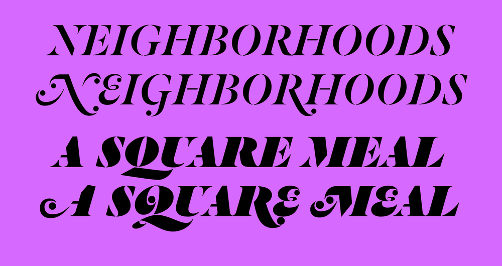 The expressive swash forms have a dramatic effect.
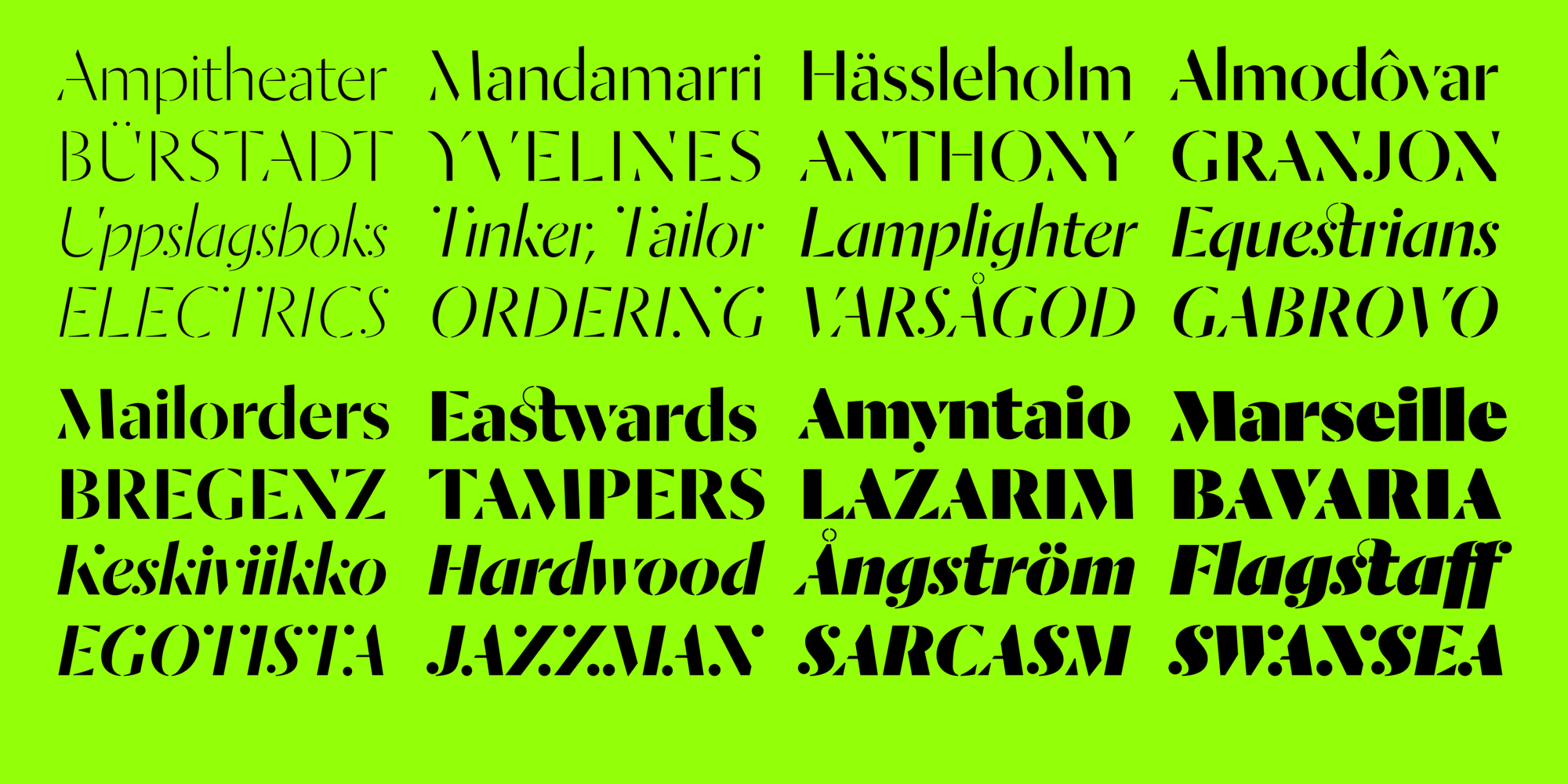
Dala Moa shares the proportions of its cousin Dala Floda. It takes the same inspiration – the erosion of letters on stones – but takes the idea one stage further with the removal of serifs, revealing basic structures. The forms and proportions of the romans come directly from Dala Floda, while the italic diverges into the upright humanist tradition. The lighter weights show the influence Jan Tschichold’s stencil experiments of the 1930s, and in particular his lesser-known display face Saskia released by Schelter & Giesecke.
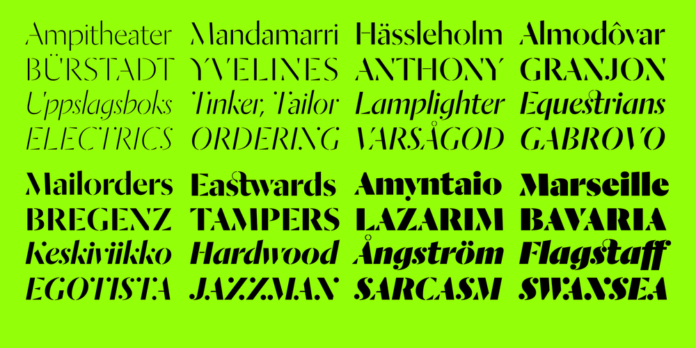 Dala Moa has eight weights, from a delicate Thin to a powerful Fat.
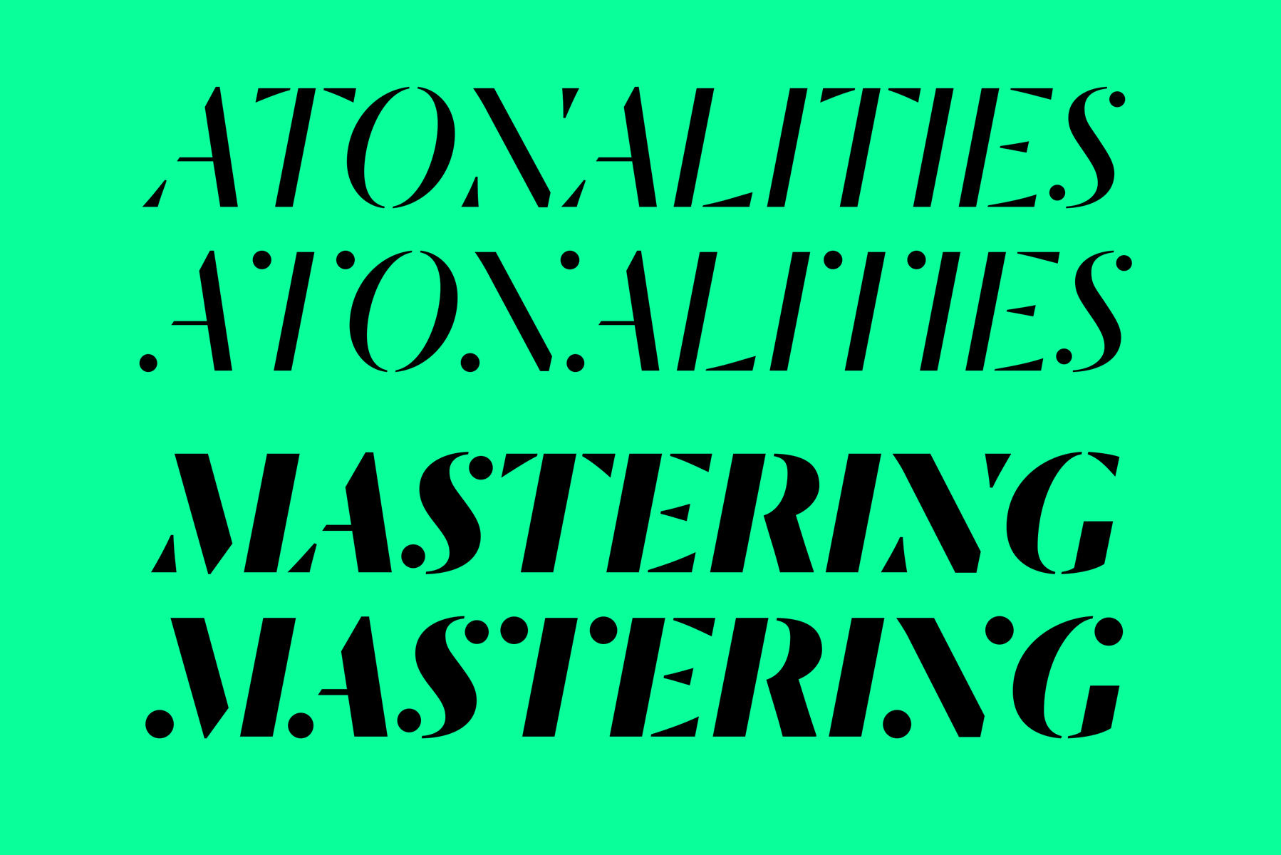
Dala Moa's swashes are quite subtle, substituting ball forms for the wedge shapes of the terminals on diagonal letters like A V W X Y v w x and y, as well and M N and T. These alternates bring another level of abstraction to the already simplified forms.
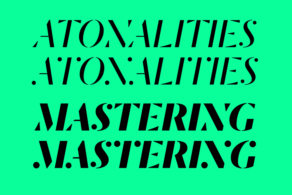 While Dala Moa's swash forms don't have the exuberance of those in Dala Floda, they have a big impact.