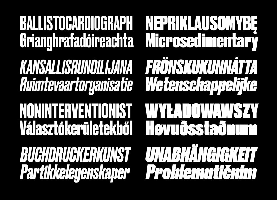
DRUK CONDENSED
DRUK WIDE
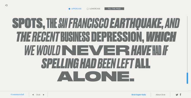
How this microsite works
Druk
Designed by Berton Hasebe, Druk is a study in extremes, featuring the narrowest, widest, and heaviest typefaces in the Commercial Type library to date. Starting from Medium and going up to Super, Druk is uncompromisingly bold. Druk was designed without a normal width, nor lighter than medium weights, as Hasebe wanted to avoid shifting the focus of the typeface away from the most emphatic styles to accommodate more general-purpose usage.
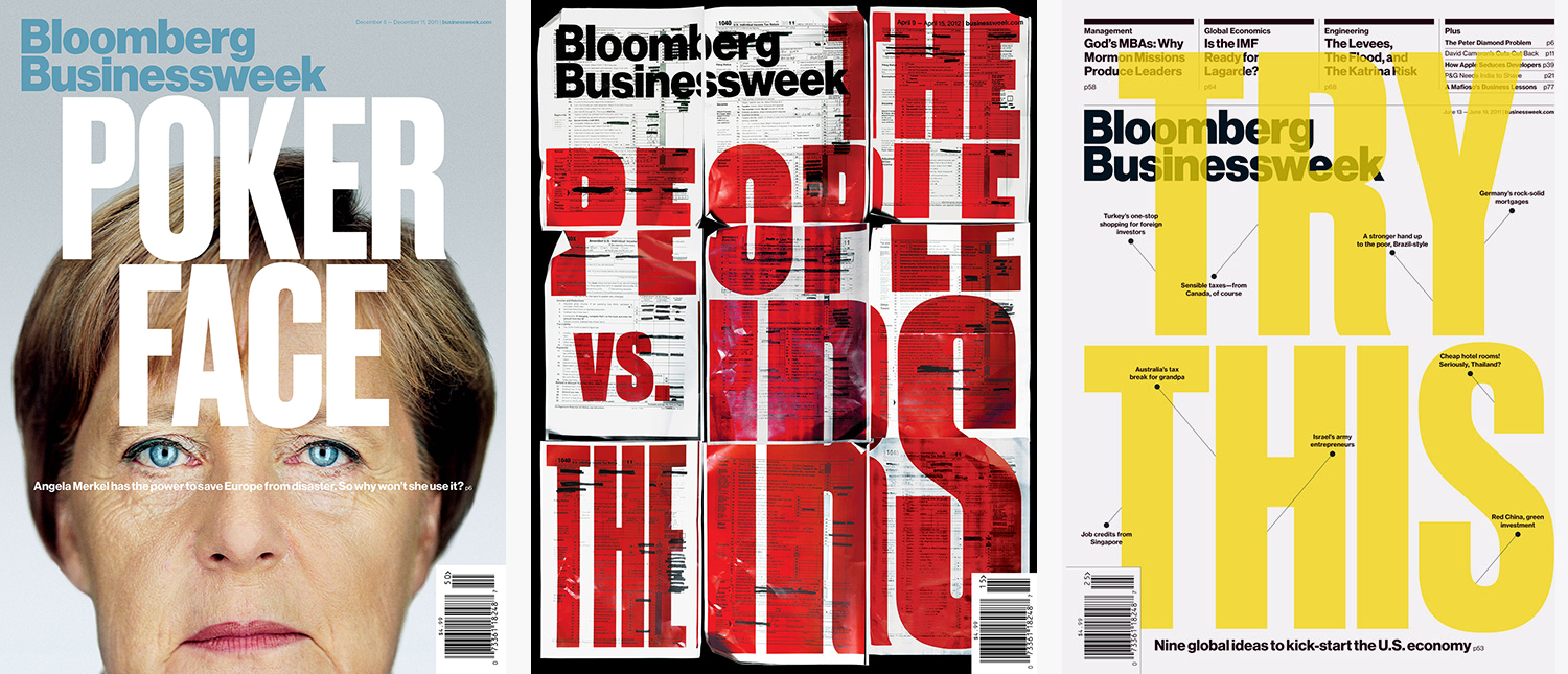
Druk has its roots in type from the past: the sans serifs created in the 19th century onwards and popularised in the 20th century for powerful display typography. These were mainly used for posters and editorial design, and were often the loudest voices in the typographic spectrum. However, Druk is designed with a particular kind of graphic design in mind, rather than reverently preserving these old forms. Hasebe created Druk for Richard Turley at Bloomberg Businessweek. After using a staple diet of Neue Haas Grotesk and Publico for two years, they wanted to add a typeface that would look both exciting and distinctive in and of itself, and wouldn’t force the designers to work as hard to make every headline – all of which had been in Neue Haas Grotesk up to this point – visually engaging. The result was Druk, which went on to play a major role in many of their iconic covers.
Druk’s so-called ‘normal’ width would probably be called a condensed in any other typeface. Its flat sides allow it to be spaced tightly and very consistently, while subtle oddities in its proportions keep it from looking monotonous. The Super weight manages to be very loud without becoming a charicature of itself. Instead, it projects solidness. This width of Druk was designed with poster-style typography in mind, where a short headline needs to have a lot of impact: book covers, opening spreads for magazine features, broadcast design, and of course posters.
 The 'normal' width of the Druk family is comprised of four weights, with italics.
 Druk appeared on many of Bloomberg Businessweek’s iconic covers.
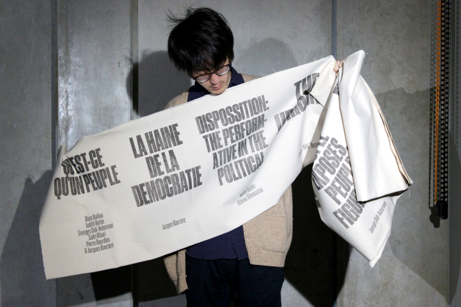
 Atelier Carvalho-Bernau used Druk in their concept sketches for a book series on politics and protest. The titles were screenprinted on banners, held here by their former intern Ohri. Photograph by Masaki Komoto
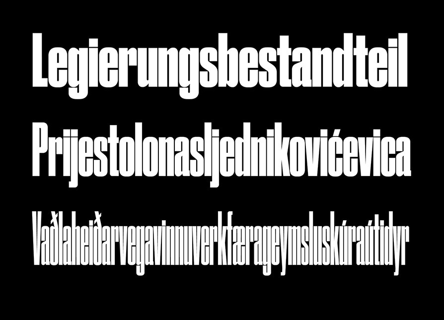
Of the families in the Druk collection, Druk Condensed is the most explicit homage to Willy Fleckhaus, legendary German art director of the 1960s style magazine Twen. Its flat sides make letters and words snap together in a clean and satisfying way. Druk Condensed features three widths in the same Super weight. The Condensed and X Condensed are very graphic, and the XX Condensed becomes almost abstract. Druk Condensed takes the idea of poster-style typography to almost ludicrous extremes.
 Druk Condensed family
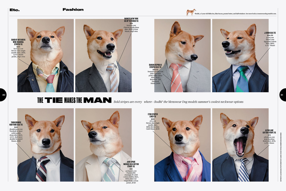
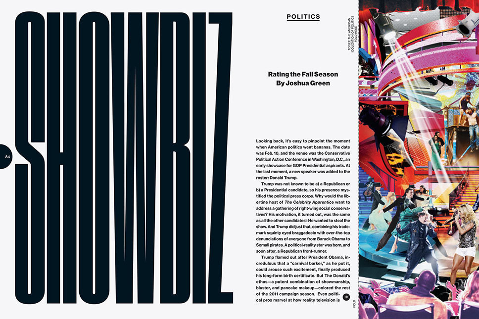 A spread from the 2011 Year in Review issue of Bloomberg Businessweek.
Druk Wide is first and foremost an homage to the way Dutch graphic designers of the early- to mid-20th century commonly used wide, bold sans serifs (Annonce Grotesk and others) to add a strong typographic hierarchy to their work. A prime example of this usage is Willem Sandberg’s set of catalogs for the Stedelijk Museum in Amsterdam. Used on its own, Druk Wide makes words and sentences that can be arranged in stacked, brick-like arrangements for very satisfying page constructions. When mixed with Druk and Druk Condensed, display typography takes on a surprising, staccato texture, reminiscent of some of the headline treatments in Spy magazine under Alexander Isely in the early 1990s, which remain surprising and fresh today.
 Druk Wide family
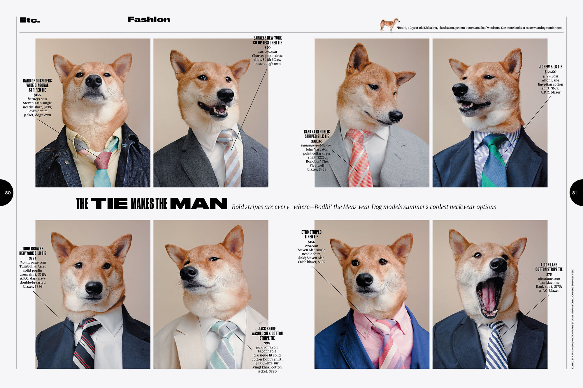
 A spread from the ETC section of Bloomberg Businessweek.
Druk's three widths can be mixed together for bold and expressive typographic treatments. Each style has a matching italic, all of which are at the same angle, so they can be mixed freely regardless of width.
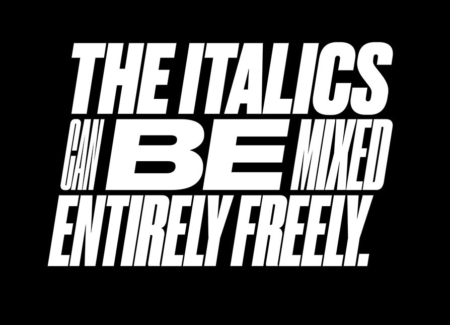 Druk's italics are all at the same angle, regardless of width.
We used a custom input field to break user input into separate word containers styled with one of the 22 styles of Druk selected at random. For users who don't feel like typing their own text, we've used part of Mark Twain’s speech “The Alphabet and Simplified Spelling”, an address at the dinner given to Mr. Carnegie at the dedication of the New York Engineers’ Club, December 9, 1907.