DUPLICATE SLAB
DUPLICATE IONIC
How this microsite works
Duplicate
While trying to get past a creative block a number of years ago, Christian Schwartz used a process beloved by many musicians. He tried to recreate a favoured typeface from memory, just as a musician would try to play a beloved song, but in doing so create a new sound. He wanted to see what he would remember correctly and what he would get wrong, and to see what kind of relationship would emerge between the inspiration and the result. He chose Roger Excoffon’s Antique Olive as his starting point, which at the time of its release had been a departure from the grotesks popular in Europe in the middle of the 20th century, and remains evocative of 1960s France. Sadly, this typeface’s reputation has been tarnished in the US by it being bundled with vinyl cutting systems for sign making, condemning it to decades of being stretched and squeezed on cheap plastic signs in every corner of the country, from small towns to urban neighborhoods.
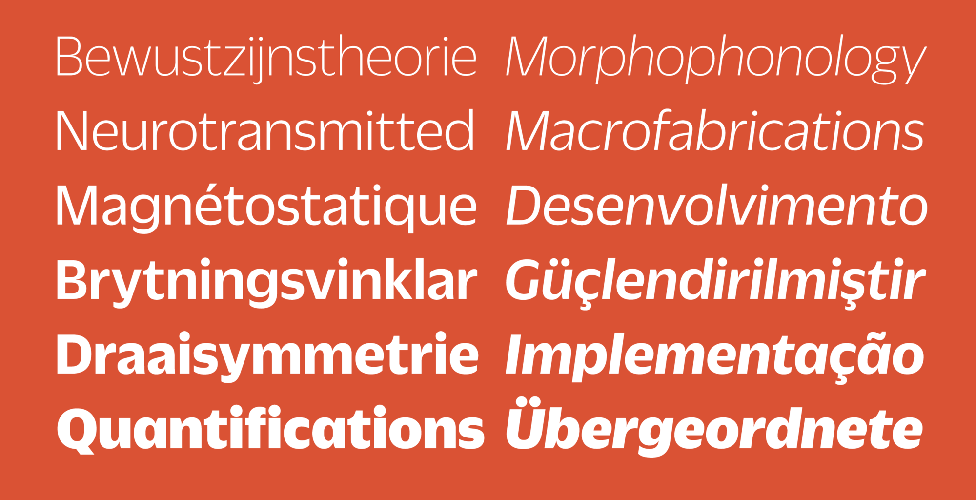
Schwartz started this exercise fully expecting to discard the result. However, he was surprised to see that, in spite of structural similarities to Antique Olive (and a handful of shared details, such as the shape of the lowercase a) what he ended up drawing was not a revival, but rather a thoroughly contemporary homage to Excoffon with a personality all its own. Duplicate Sans is primarily a display face, and is spaced accordingly, but its large x-height means that it also works well for text, if given adequate tracking.
 Duplicate Sans has six weights, from Thin to Black. The influence of Antique Olive is most visible in the heavier weights.
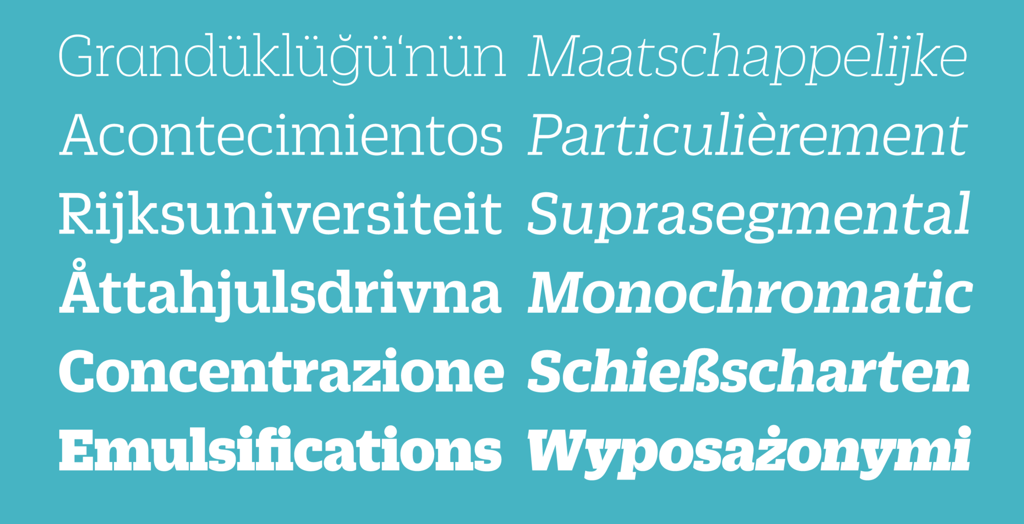
Duplicate Sans was finally finished for Florian Bachleda's 2011 redesign of Fast Company. Bachleda wanted a slab companion for the sans, so Schwartz decided to take the most direct route: following the example of the early 20th century slab serifs like Memphis and Rockwell, which were simply geometric sans serifs with slab serifs tacked on, he added slabs to the sans in a straightforward manner, doing as little as he could to alter the proportions, contrast, and stylistic details in the process. Duplicate Slab, like the Sans, is first and foremost a display face, but its warm, organic forms make it function well for short blocks of text. With additional tracking, it works well for captions and subheads, and is also suitable on screen for navigational elements.
 Duplicate Slab comes in the same set of six weights.
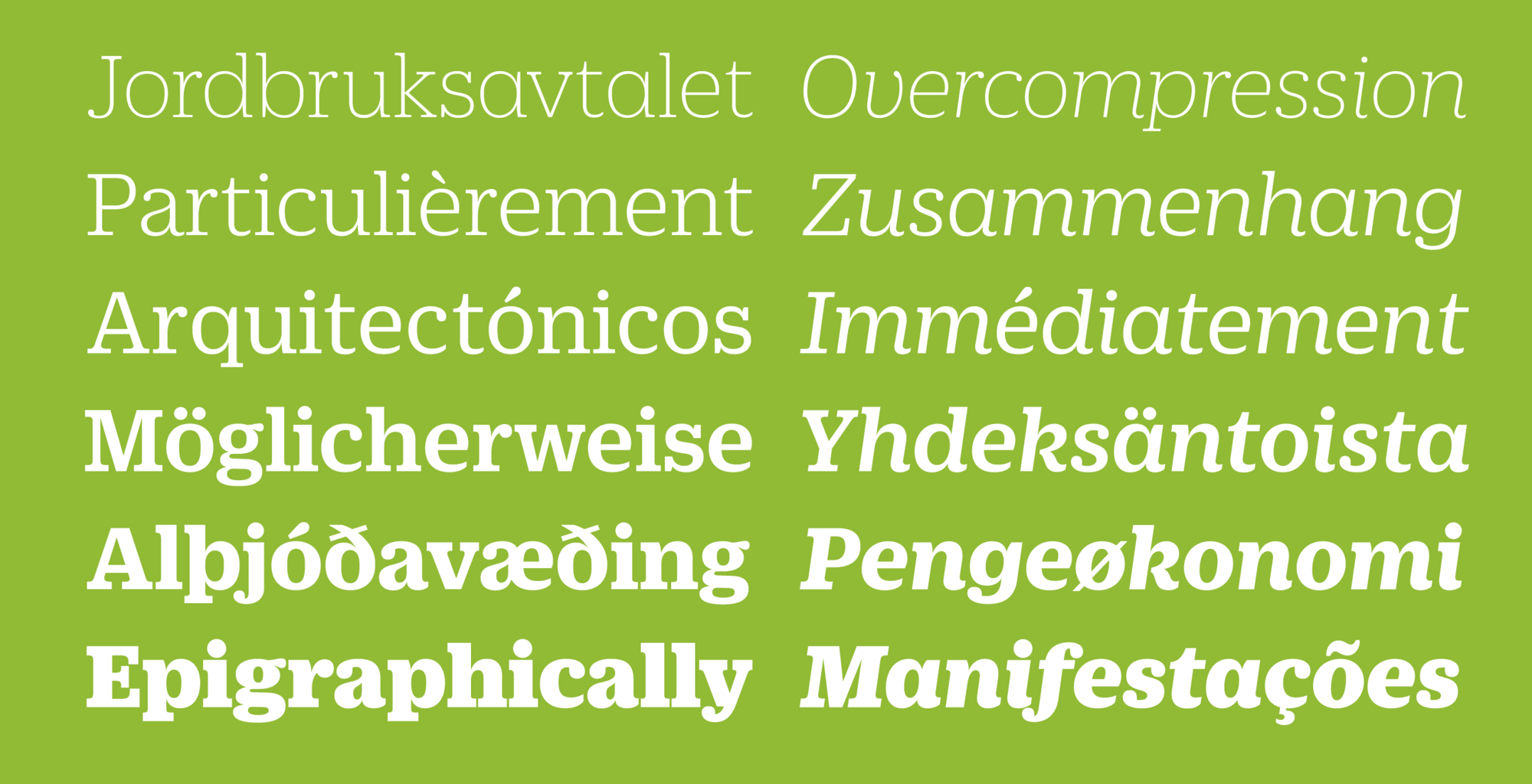
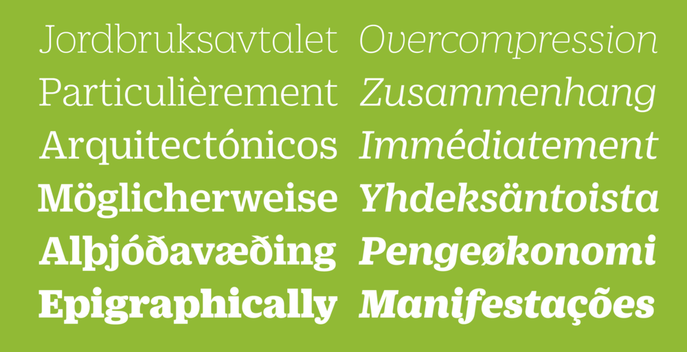
Schwartz's first idea for a serif face to match Duplicate Sans was not as straightforward as the slab that Fast Company ended up commissioning. Instead, he saw a certain affinity between the organic shapes of Antique Olive and the strong, warm tone of the Clarendon genre. The bracketed serifs and ball terminals that define this genre (also known as Ionic) first emerged in Britain in the middle of the 19th century. Even after finishing Duplicate Slab, the Ionic sketches seemed to have potential to bring both a softer display face and a proper text face to the collection. The romans are a collaboration between Christian Schwartz and Miguel Reyes, but the italic is fully Reyes’s creation, departing from the sloped romans seen in Duplicate Sans and Slab with a true cursive.
 Duplicate Ionic also has the same set of six weights, but a more traditionally cursive italic.
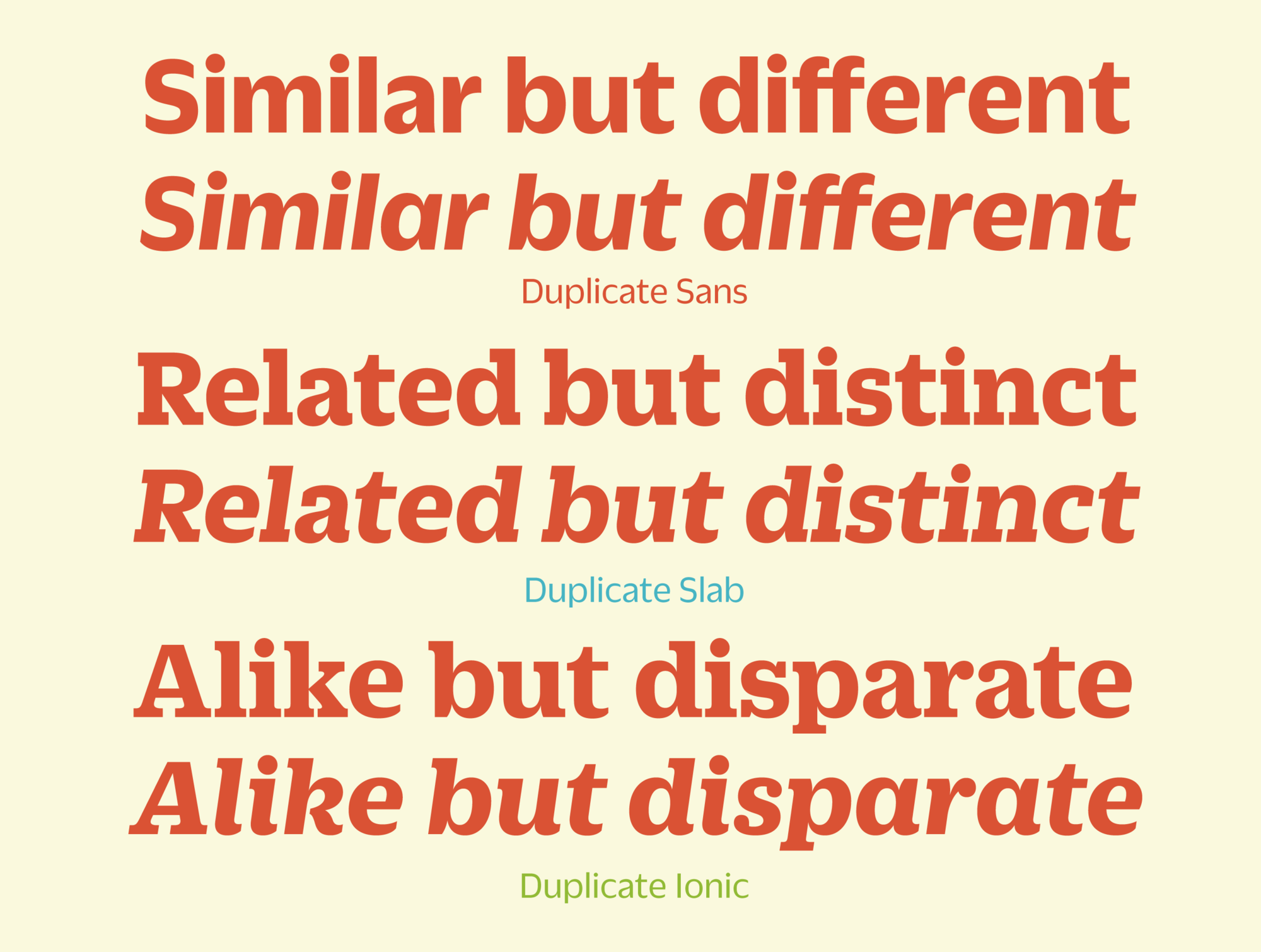
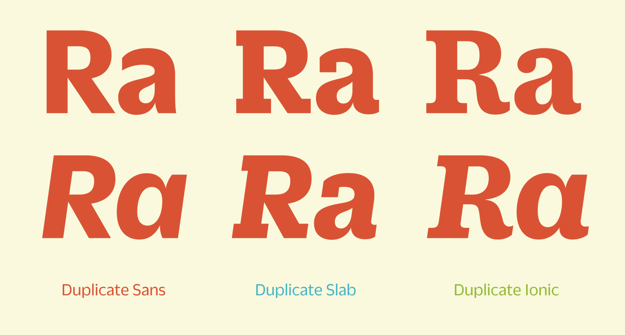
The three families in the Duplicate collection can be used together, or can separately combine with other families. The close formal connection between the Sans and Slab families allows the Ionic more room to do its own thing, with more traditional Clarendon structures for many characters, and a true cursive italic rather than the sloped romans of the other two families.
 Duplicate's three families are related but different from one another, each able to fill different roles in graphic design.
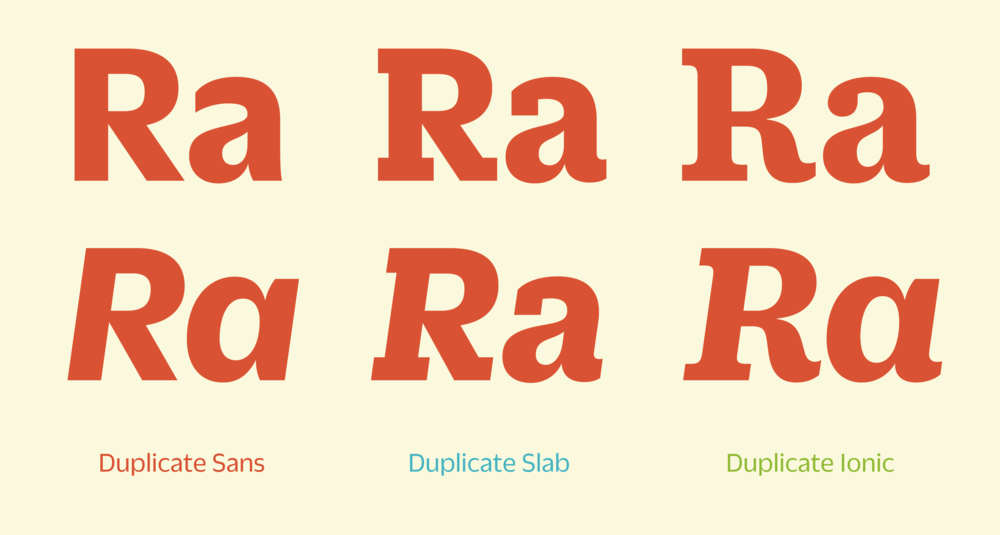 The relationship between the Sans and Slab is clear and direct, while many characters in the Ionic are quite different from the other two, more closely following the Clarendon influence.
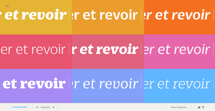
This microsite has a collection of 25 containers, each of which is randomly assigned a typeface from the Duplicate collection, a point size, and a color. As the user types, the same text is copied to each container. Each time the user presses the space bar, the size of the containers and type size change, and the typeface and color of each container is changed at random.