GIORGIO
GIORGIO SANS
How this microsite works
GIORGIO SANS
How this microsite works
Giorgio
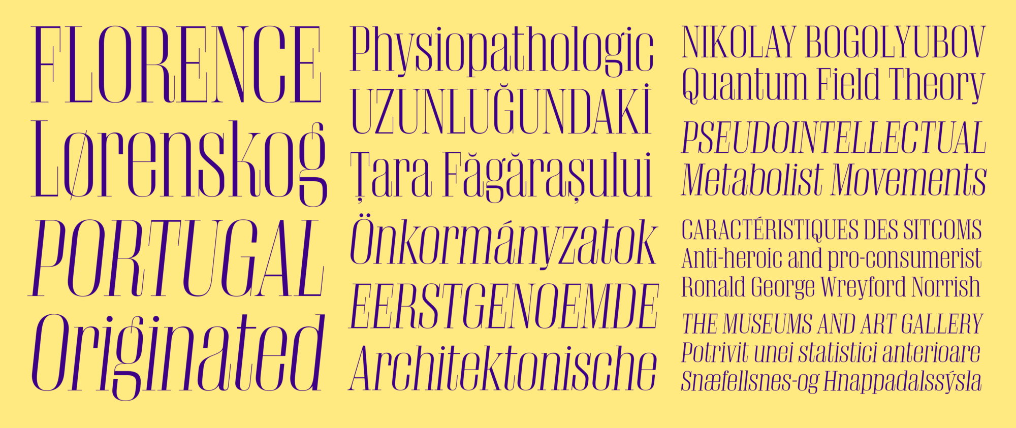
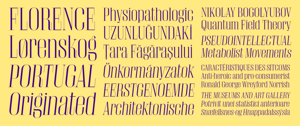
Giorgio is a pair of condensed display faces with large x-heights and flat sides. Though they share a common proportion and underlying structures, they have very different personalities. Both were originally designed for T, the New York Times Style Magazine.
Inspired by the tall skinny proportions of the catwalk and the graphic style of the twenties and thirties, Giorgio was designed to be used for just one year's worth of issues of T, the New York Times Style Magazine. With strong contrast between thick and thin, Giorgio offers aggressive beauty in 4 optical sizes. It is not currently available for use on the web, but can be licensed for desktop use and embedding in mobile apps.
 Giorgio, just a single weight in four optical sizes, is the kind of typeface that demands to be used in a specific way.
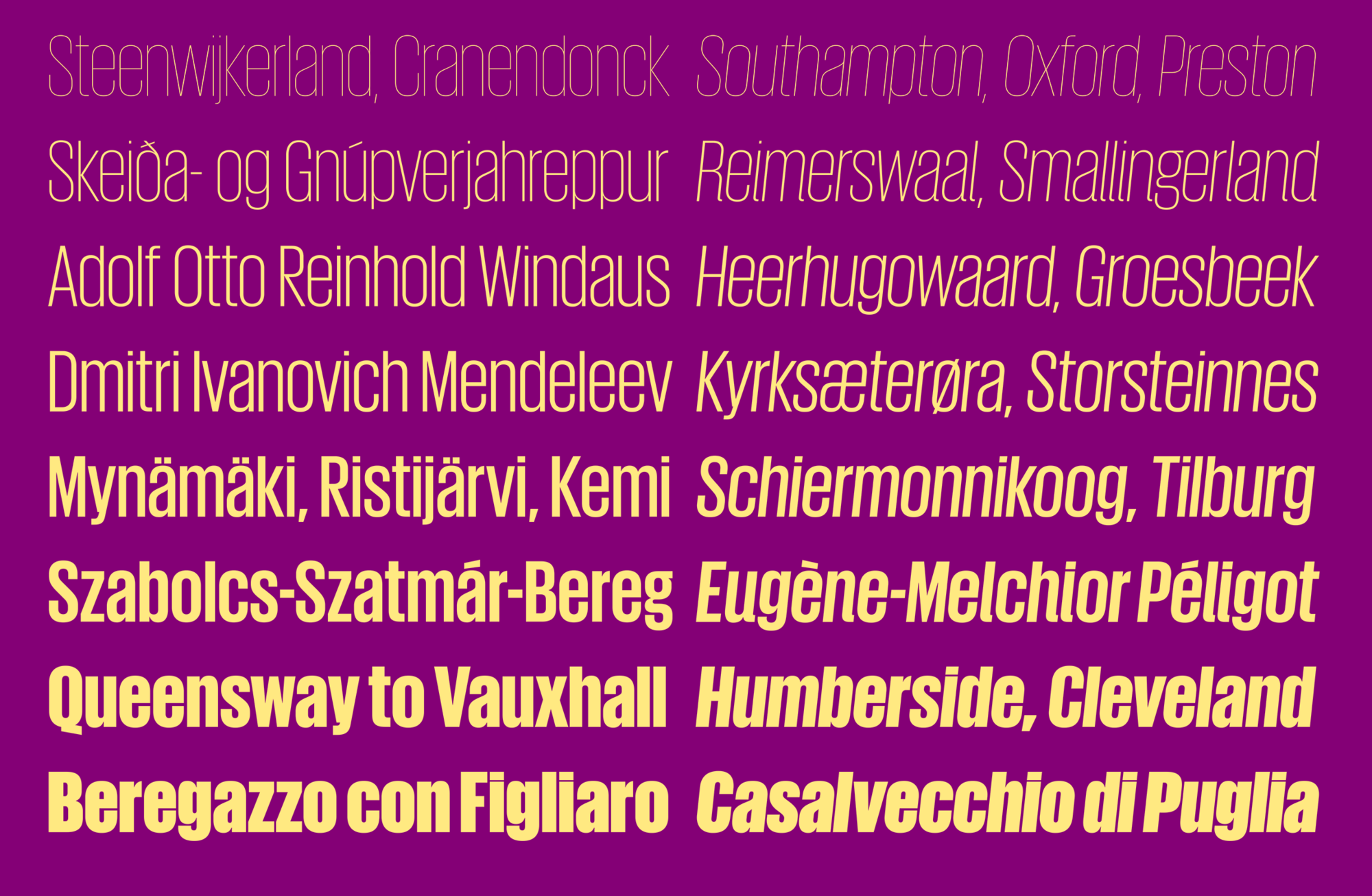
Rather than drawing from the high-fashion Art Deco influences seen in the serif, Giorgio Sans was inspired by more everyday sources such as French enamel signs and generic straight-sided American sign lettering from the early 20th century. The extreme x-height helps to differentiate Giorgio Sans from other straight-sided sans serifs; this and the straight-sided bowls connect the sans back to its serif companion.
An early version of the face had a set of perfectly circular alternate round caps, which created interesting rhythms and textures in lines of copy. Although these weren’t used in any of the T layouts, they made their way into the eventual release, and can be included upon request in the web version. Giorgio Sans is a stylish alternative to condensed sans serifs like Impact.
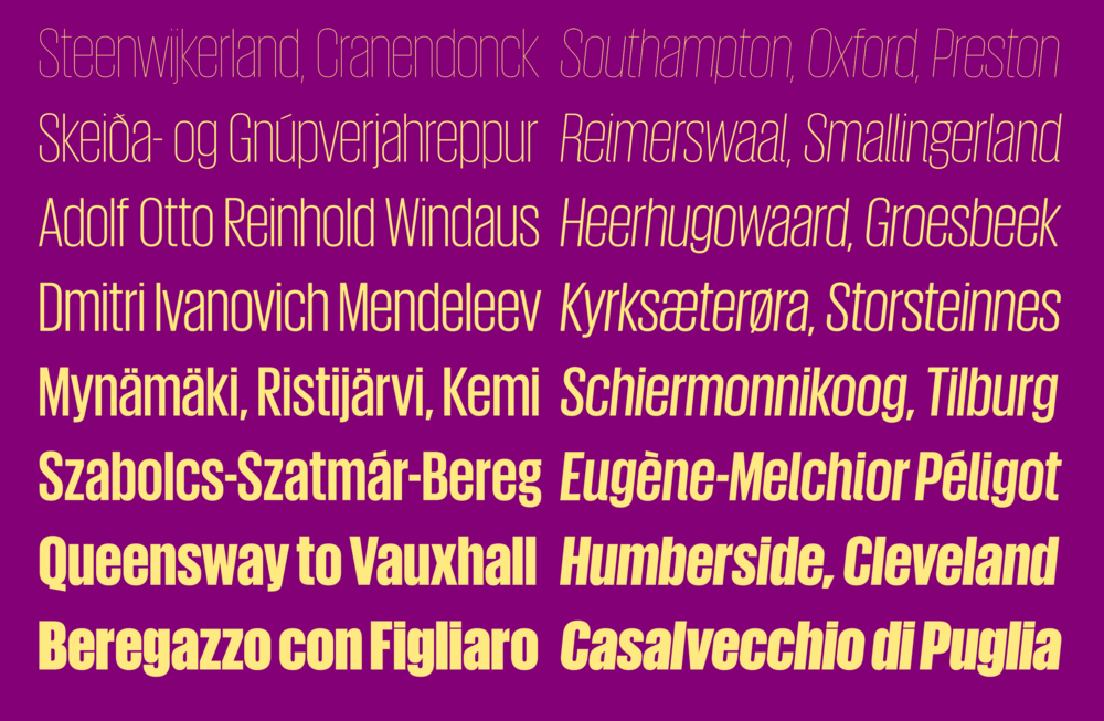 Giorgio Sans, on the other hand, is relatively flexible, with its wide range of eight weights.
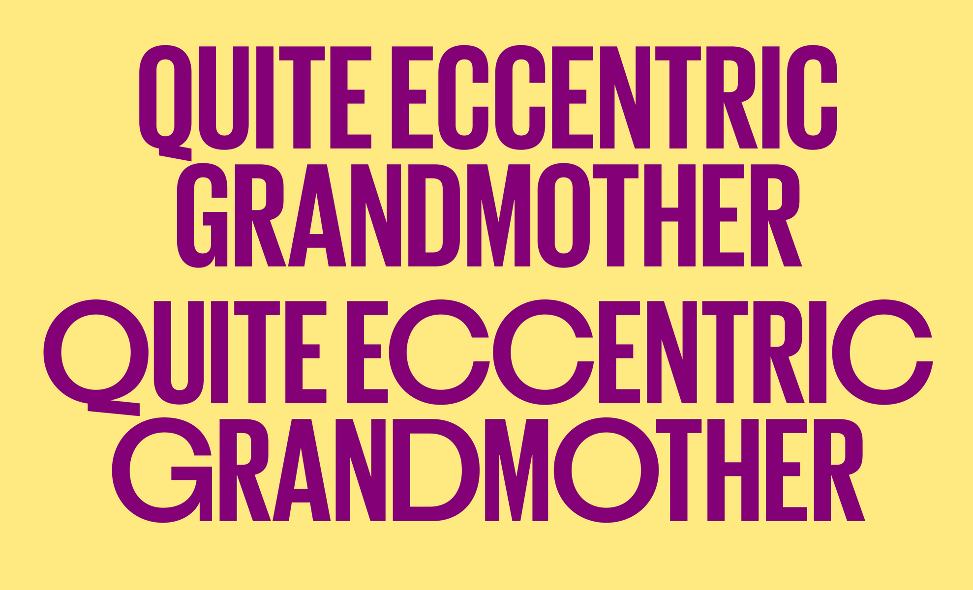
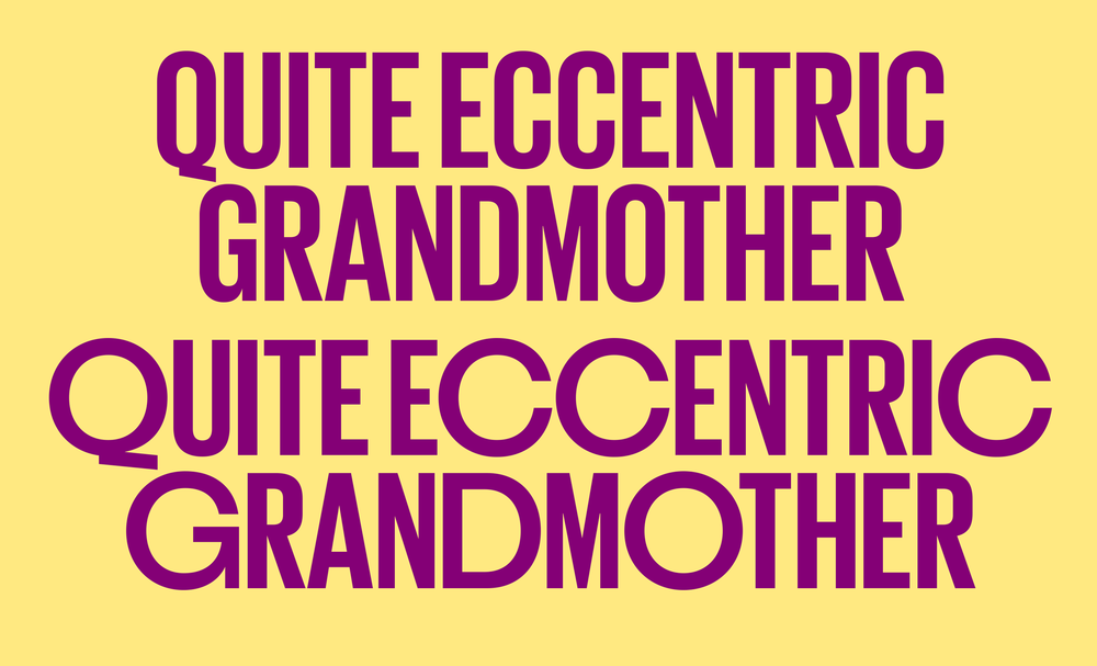 The round alternates throw the uniform proportions of the caps into an entertaining chaos.
How this microsite works:
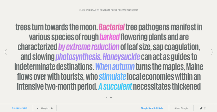
Kat JK Lee wrote a unique piece of text for each weight, each of which was broken into small chunks. Each short essay is relatively dry, to give the impression of a scientific paper or technical writing when read en masse, but each is made up of interesting phrases that would take on a different feeling when viewed in a different context. A maximum of 10 phrases can be selected. When the poem is submitted, the current weight and point size are stored, along with layout information to preserve the user created poem on subsequent viewings by other visitors.
Kat JK Lee wrote a unique piece of text for each weight, each of which was broken into small chunks. Each short essay is relatively dry, to give the impression of a scientific paper or technical writing when read en masse, but each is made up of interesting phrases that would take on a different feeling when viewed in a different context. A maximum of 10 phrases can be selected. When the poem is submitted, the current weight and point size are stored, along with layout information to preserve the user created poem on subsequent viewings by other visitors.