How this microsite works
Graphik
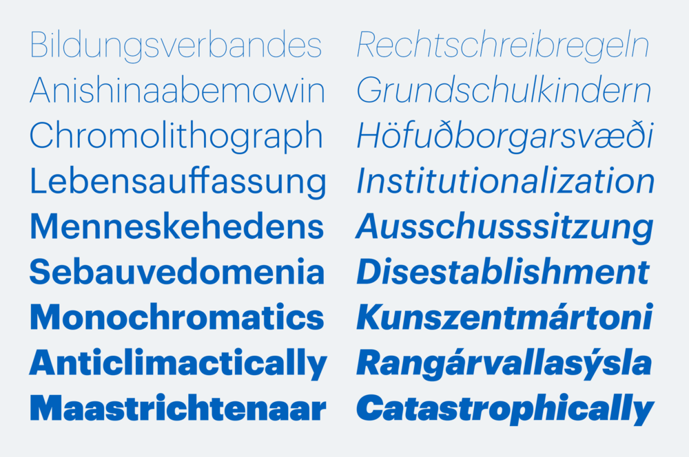
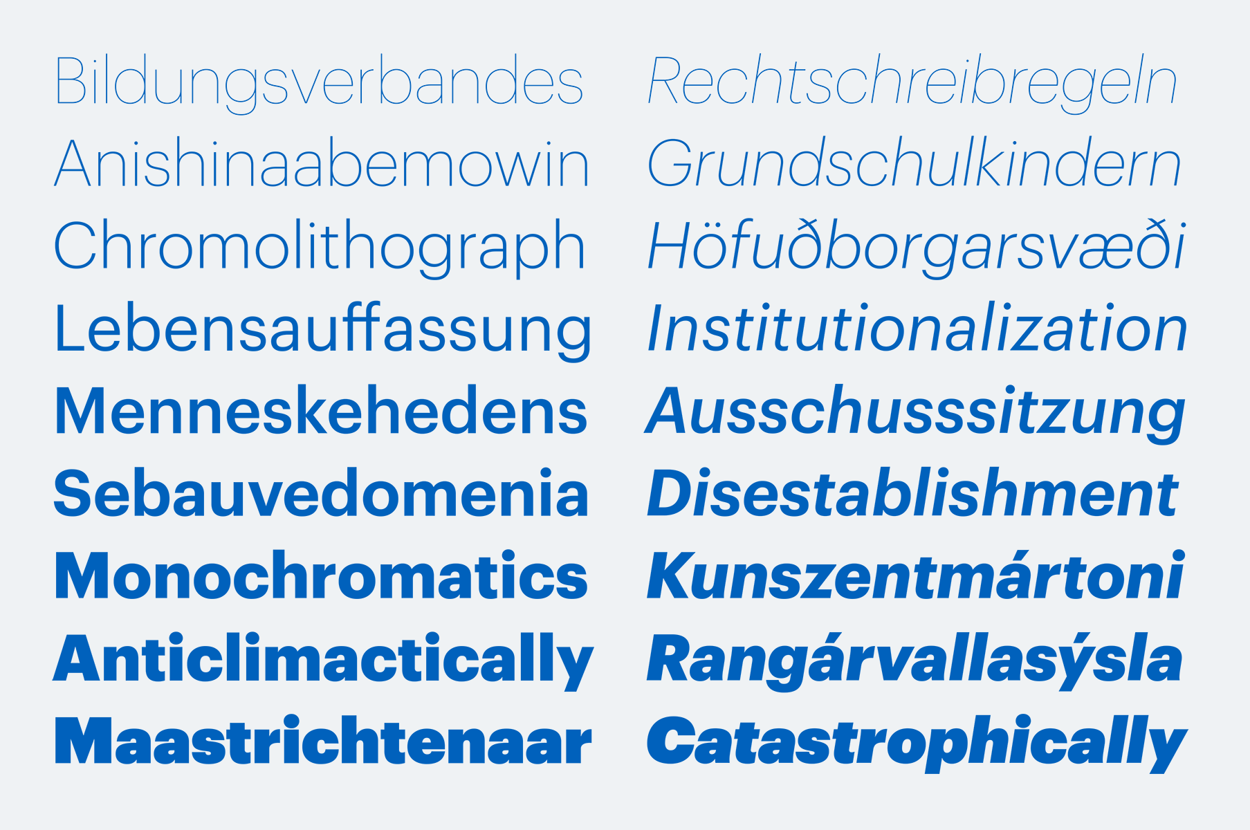
The dominant trend of simple, mid 20th century sans serifs from continental Europe still reverberates in visual culture. Graphik proves that it is still possible to create something refreshing inspired by this aesthetic.
Graphik was inspired by all parts of the 20th century, but the primary inspiration came from graphic design, rather than typefaces. Like many people with a fondness for graphic design history, Schwartz had long admired these posters after first being exposed to them in design history classes at college. Many of them were set in Akzidenz Grotesk and other “generic” sans serifs, but others were lettered in a plain but idiosyncratic geometric style. Schwartz was very attracted to the idea of expressive graphic design done with very plain type.
Graphik is a blank slate, a vanilla-flavored typeface that is perfectly suited for publication design as well as graphic design or corporate identity work. While Helvetica or Univers might be too ubiquitous for contemporary Modernist influenced graphic design, Graphik fits naturally to the aesthetic while being refreshing. The round dot on the i, plus related forms like the period, brings an extra bit of warmth to the family, subtly making it appear more contemporary.

It’s interesting to note how much impact you can have on the overall personality of a typeface by changing just one frequently used letter. Graphik has two alternates, a and t, each of which has a significant impact. Because browsers haven’t yet consistently implemented access for OTF layout features through CSS, these alternates can be substituted into webfonts by request at no additional charge.

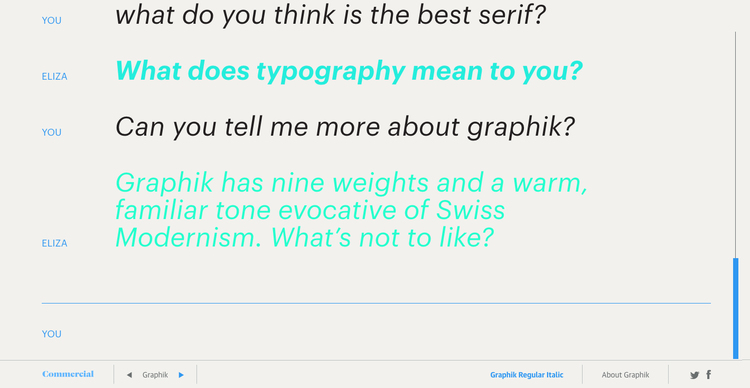
This layout uses Norbert Landsteiner's JavaScript implementation of the ELIZA chatbot [link] with a custom rule set. ELIZA was originally written by Joseph Weizenbaum at MIT between 1964 and 1966, and is a very early example of natural language processing. User input is always styled in Graphik Regular Italic; the responses are in randomly selected styles of Graphik. Try asking her what she thinks of different typefaces from our library.


