GUARDIAN EGYPTIAN TEXT
GUARDIAN SANS HEADLINE
GUARDIAN SANS HEADLINE NARROW
GUARDIAN SANS HEADLINE CONDENSED
GUARDIAN SANS HEADLINE X CONDENSED
GUARDIAN SANS TEXT
GUARDIAN AGATE SANS
How this microsite works
Guardian
A large family intended for editorial design and situations requiring complex typographic hierarchy, Guardian was designed by Paul Barnes and Christian Schwartz for Mark Porter’s groundbreaking 2005 redesign of The Guardian. As a text face it exhibits a rational and clear disposition, lending a serious air to the text, while the display components capture a wide range of moods with their comprehensive range of weights.
For those interested in how this family came about, the two-year design process is exhaustively documented in Francesco Franchi's excellent book Designing News. Christian and Paul feel a special affinity for this collection, because it was their first collaboration, starting the creative partnership that would eventually become Commercial Type.
The core of the collection, and the first part to be designed, is Guardian Egyptian Headline. It was here that the voice of the family emerged. Knowing that the client needed a serif typeface, making it a low-contrast Egyptian rather than a more traditional news headline face helped to differentiate The Guardian from its competitors and give it a distinctive and individual voice.
One influence on the Guardian Egyptian family was the multitude of slab serif faces cast by many London typefoundries in the mid- 19th century, but the construction of the romans mainly draws from contemporary Dutch type, with unbracketed serifs, squarish arches, spartan detailing and an overall feeling of openness, while the italics take unexpected structural cues from types cut in Paris and Antwerp during the Renaissance. Like most slab serifs, Guardian Egyptian has the range and utility of a sans, but its contrast and the fact that the serifs are subtly wedge shaped give it more elegance and class than typical Egyptian faces.
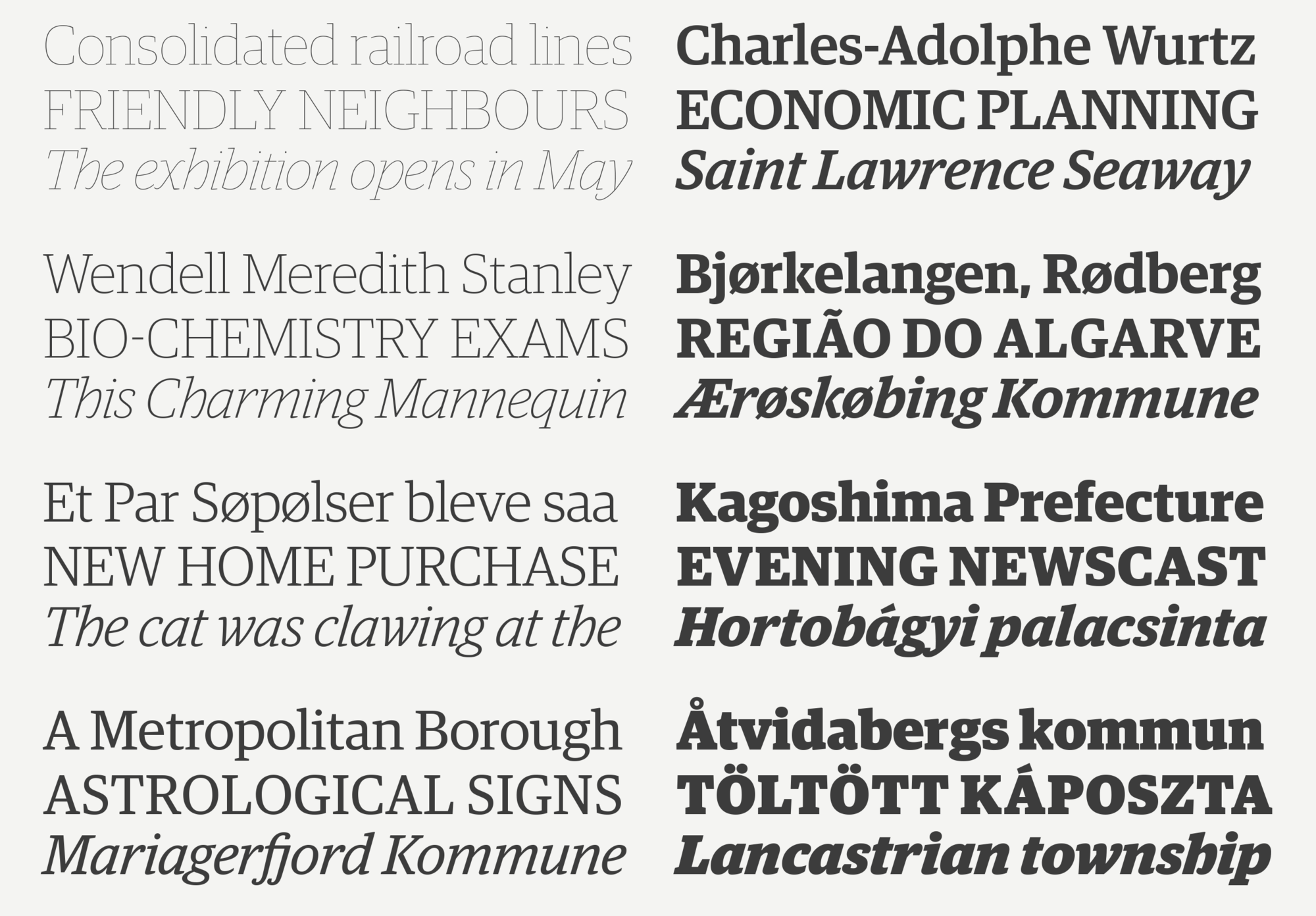
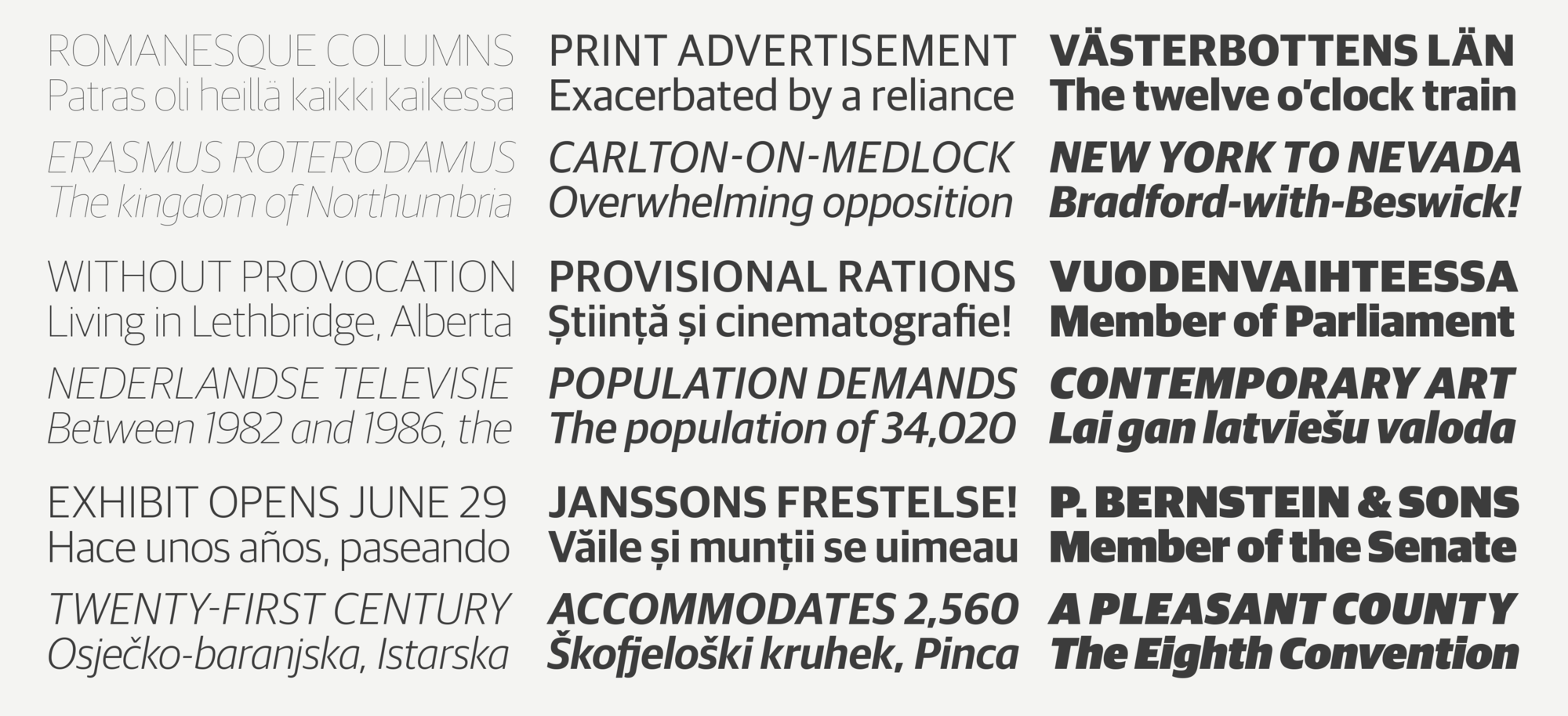
 The low contrast of Guardian Egyptian Headline allows the family to have an extensive weight range more commonly seen in a sans serif.
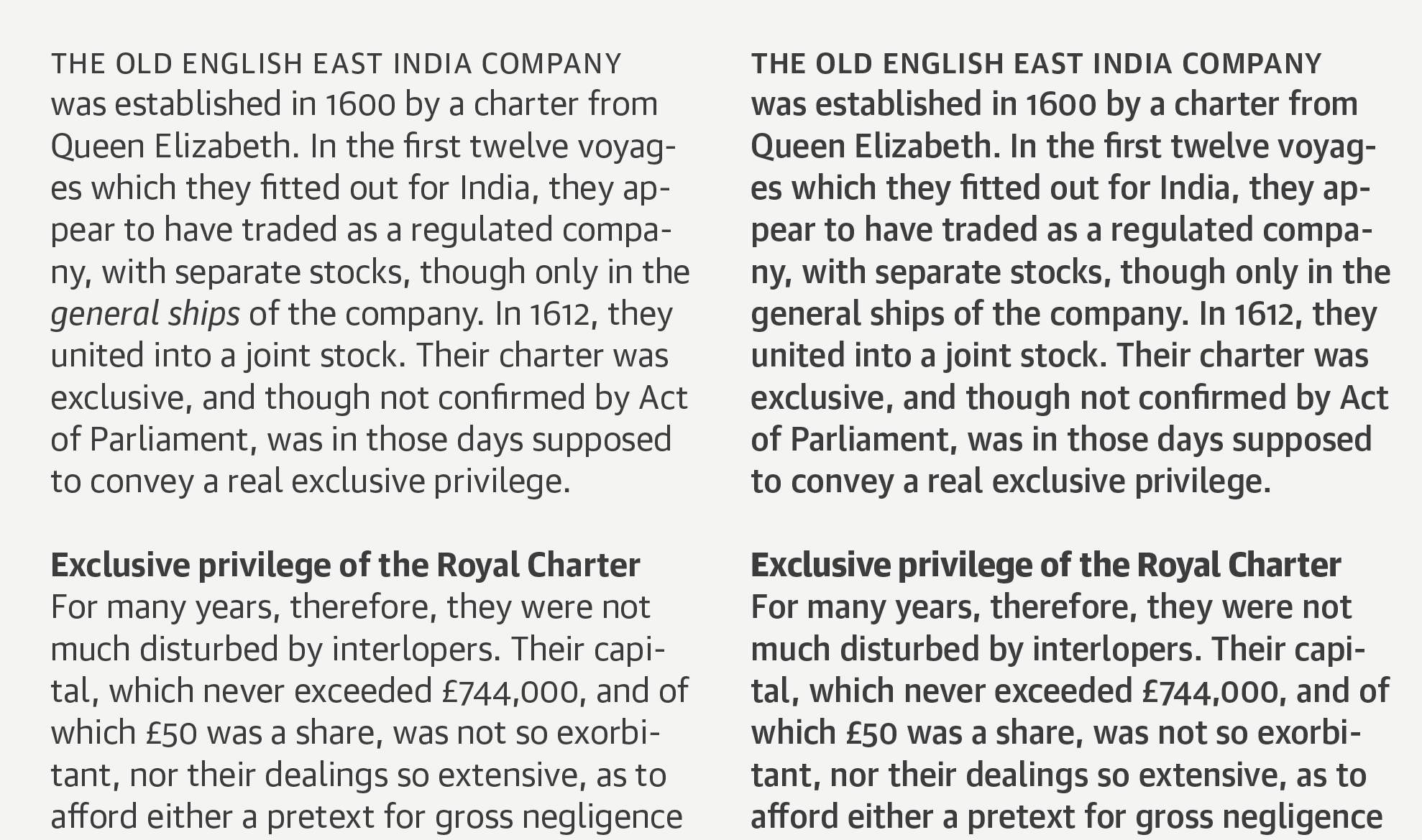
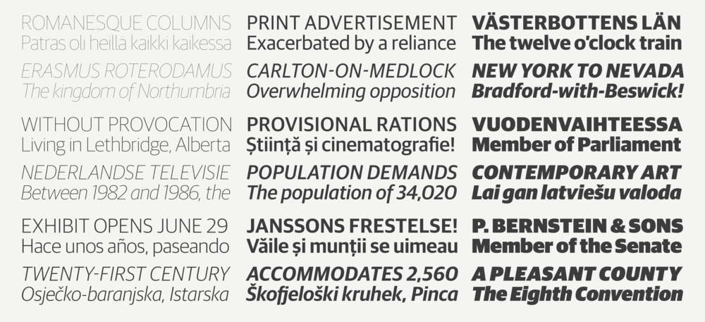
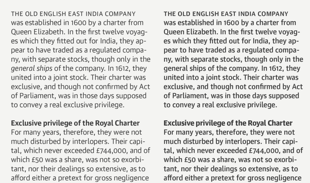
Guardian Egyptian Text was designed for newsprint. It differs in significant ways from its Headline equivalent: its italics have a gentler angle of incline and more open counterforms than the Egyptian Headline italics, toeing the fine line between having enough of a textural change for emphasis without becoming a distraction in a block of text. Also, the addition of some slabs to characters that don’t have them in the Headline version, such as a and f, evens out the color of text.
Because this family was designed for adverse printing conditions, it performs well for text on screen. Newsprint and low-resolution screens pose many of the same problems for type, so the same solutions apply: large x-height, low contrast, and clear, simplified details keep type legible when fidelity is low.
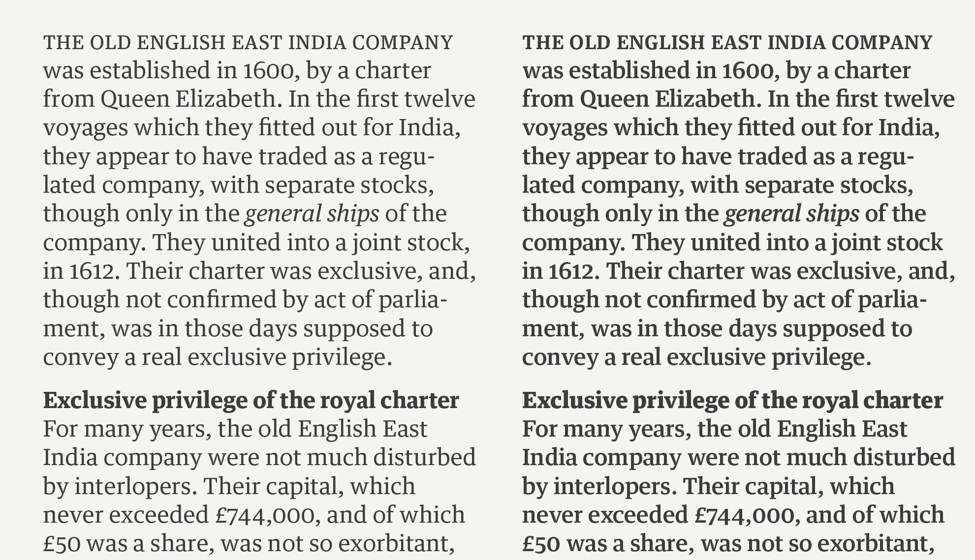
 The four weights of Guardian Egyptian Text cover the needs of complex typographic hierarchy at text sizes.
As The Guardian has transitioned from being solely a print product to primarily being consumed through digital media, via their apps and responsive website, the typefaces have been a major factor in keeping the voice of the publication, and of the brand, intact across all media.
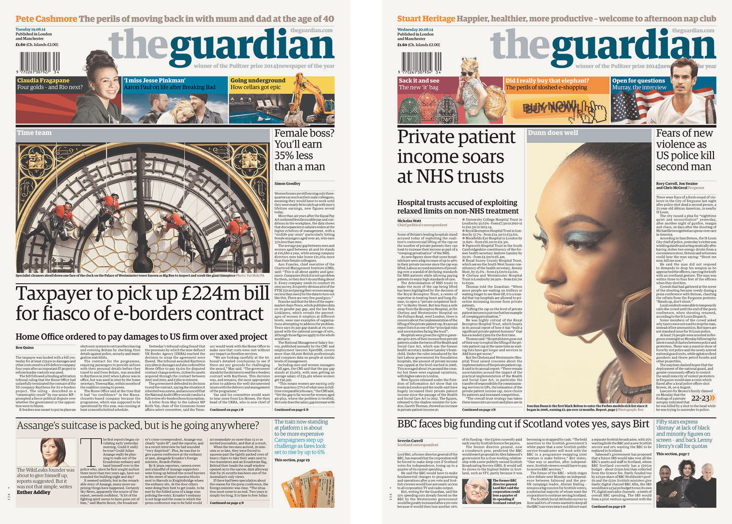
 The Guardian collection was originally commissioned for use in The Guardian, where it still looks fresh and current after nearly 10 years.
 Guardian Egyptian has been an important bridge for The Guardian as they have directed their energy to digital media, including the web.
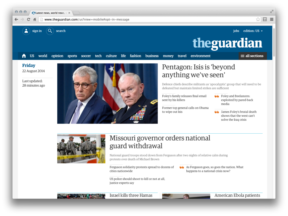
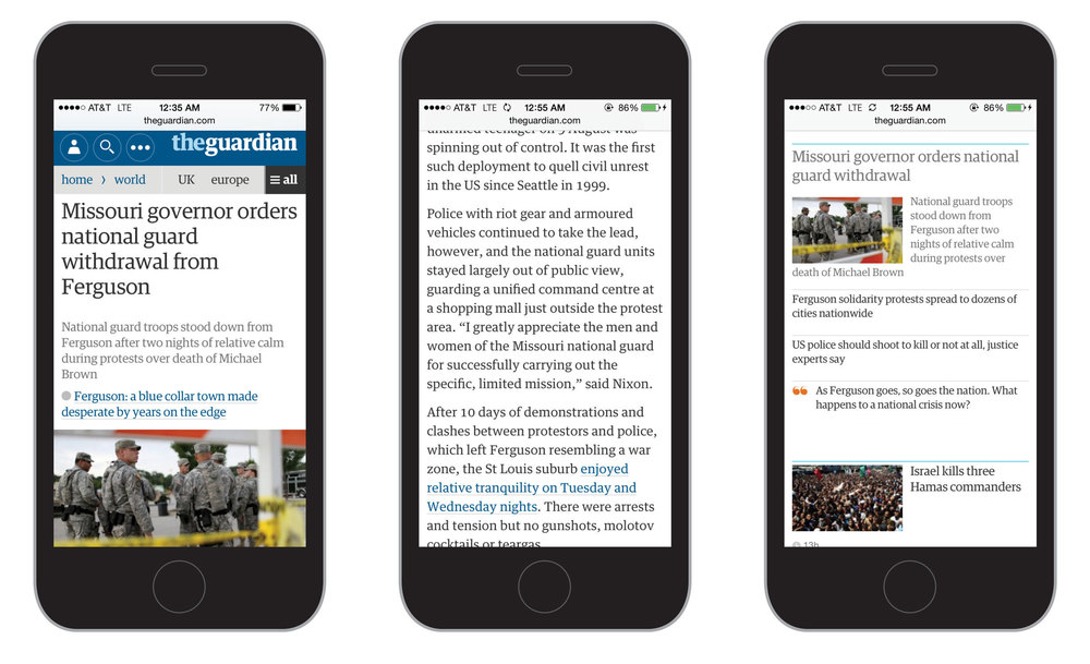 Even on the small screen of an iPhone, Guardian Egyptian helps to maintain the distinctive voice of The Guardian.
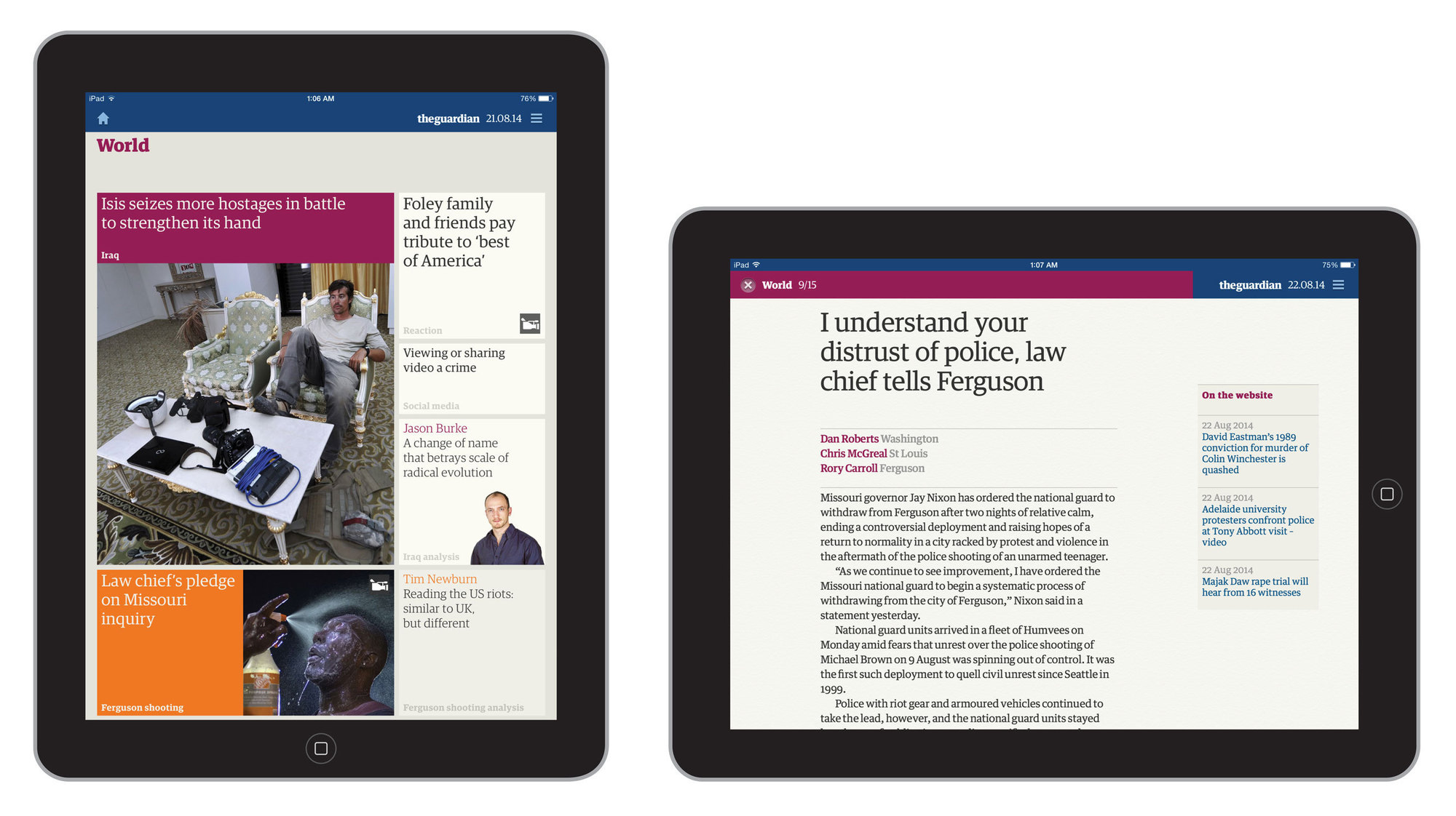
 The layouts of the iPad edition bear only a passing resemblance to the printed newspaper, but the typeface ensures that the brand comes through.
Typographic trends come and go, but one of the most enduring genres to come out of the 20th century is the humanist sans serif. Sharing a skeleton with Guardian Egyptian, Guardian Sans is more constructed than most of its humanist peers, with little influence from handwriting or classical proportions, instead, like the Egyptian, sharing a clean, approachable openness with many contemporary Dutch sans serifs, combined with the more buttoned-up British attitude as typified in the classic Gill Sans.
Though Guardian Sans Headline has only been used sporadically in The Guardian's pages (and its website and apps), it has found a place in publication design and especially in corporate design, where its clean, no-nonsense personality communicates clarity and trustworthiness.
 Though it is an ideal match for Guardian Egyptian, Guardian Sans Headline has not been used much by The Guardian.
Once the Guardian collection became available for licensing to the general public, it became obvious that additional narrow widths of Sans Headline would be useful additions. Each of these three narrower widths, all drawn by Berton Hasebe, has a different role to play.
The Narrow width is particularly useful in corporate identities and signage programs. The Condensed solves the problem of headlines with a great deal to say and not enough space to say it in without becoming cramped or squashed, maintaining the same quiet, neutral tone of the normal width. The X Condensed is useful in editorial situations, and for logotypes.
At present only Guardian Sans Headline Condensed is currently available for use on the web, with the Narrow and X Condensed planned for release in the near future.
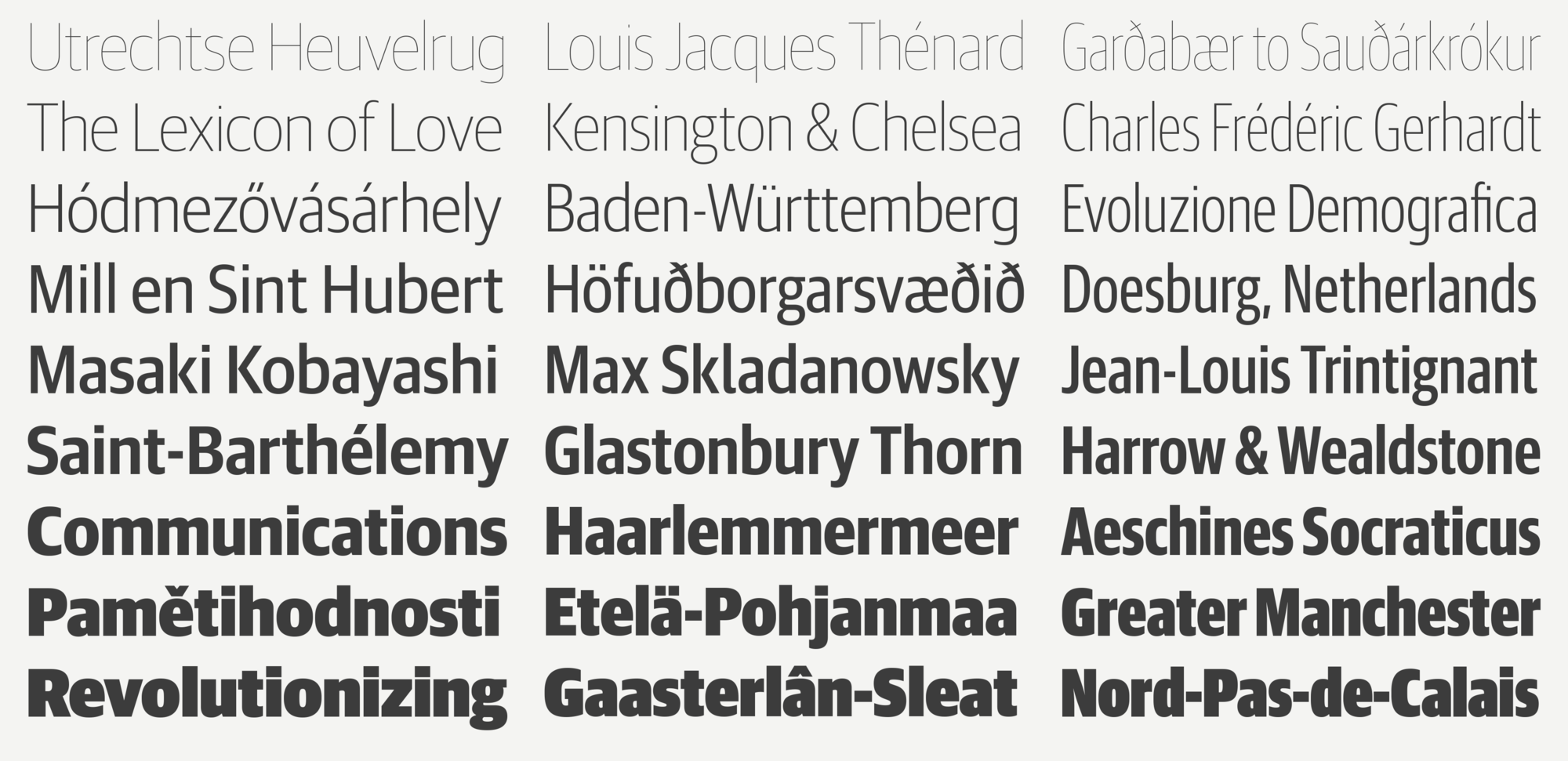
 Guardian Sans Headline also comes in Narrow, Condensed, and X Condensed weights, all with italics (not shown) for the complete range of weights.
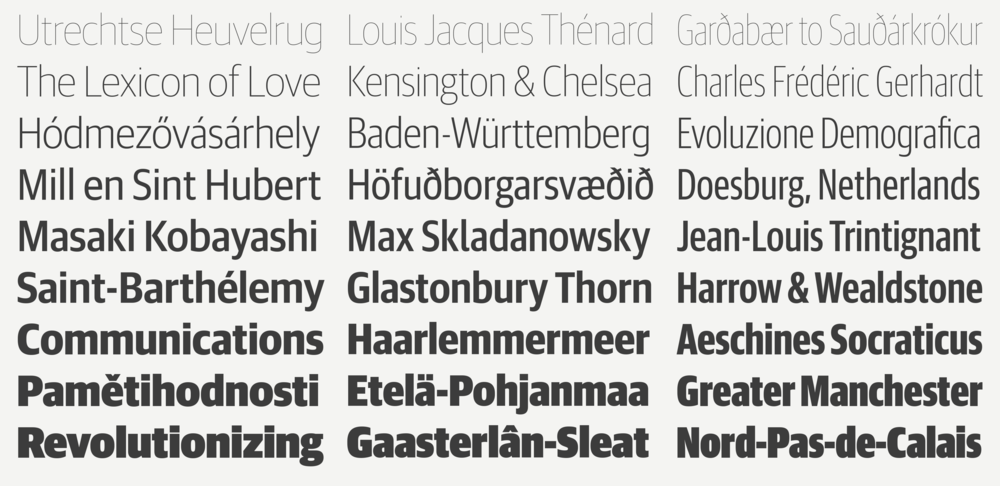
Guardian Sans Text has squarer bowls than the Headline version, ensuring that the characters remain very open and readable in text. Additionally some characters have been redrawn to improve legibility, and clarity at small sizes; the lowercase l has a tail, for example, and the lowercase g has a simplified form. Its extensive character set, matching the Egyptian Text, will fulfill even the most difficult of typographic tasks, making it especially suited to the problems of complicated information. Its compact proportions are well suited to interfaces, particularly on mobile.
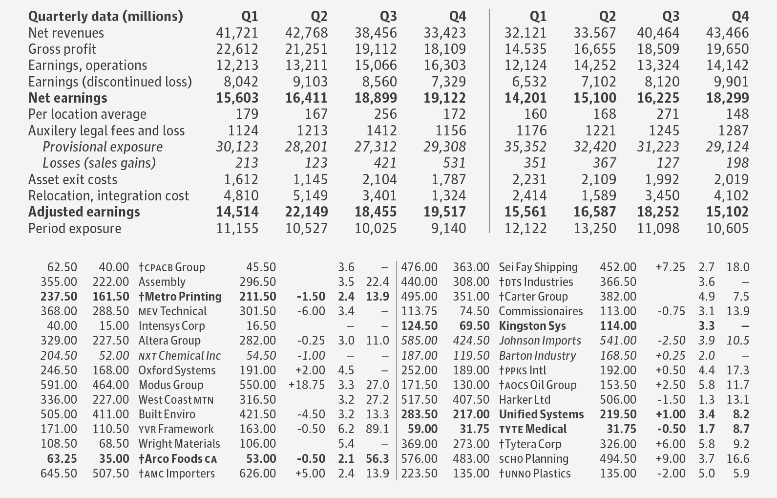
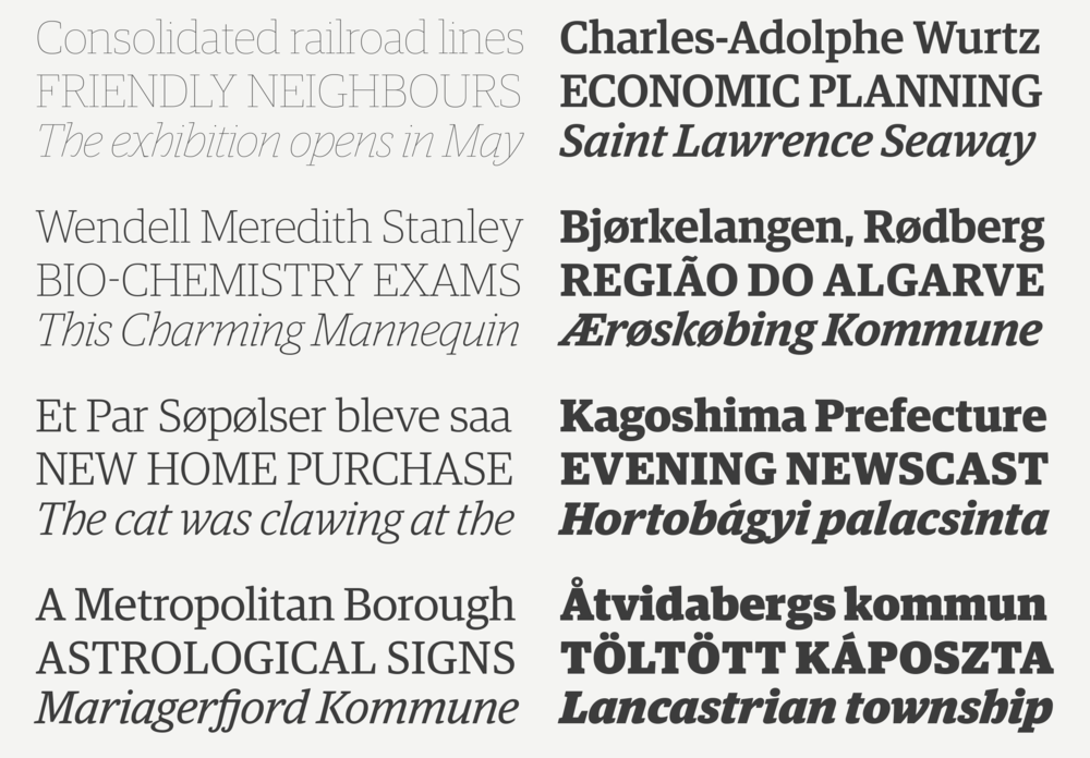
Guardian Agate Sans was carefully designed to compensate for the worst imaginable printing conditions: 6 point and below on newsprint. The optical compensations required for maximum legibility under such difficult circumstances look strange at large sizes, but at small sizes they keep the type readable. In print, the Guardian Agate Sans family features four subtly different weights, or grades, allowing users to find the perfect weight for a particular situation, from Grade 1, the lightest, to Grade 4, the heaviest. The Medium weight can be used for reversing text out of a dark background, or for subheads and cases where an additional level of hierarchy is required.
A selection of styles from this large collection is available for the web upon request, and all styles may be licensed for use in mobile apps.
 Guardian Agate Sans is designed for dense information at small sizes.
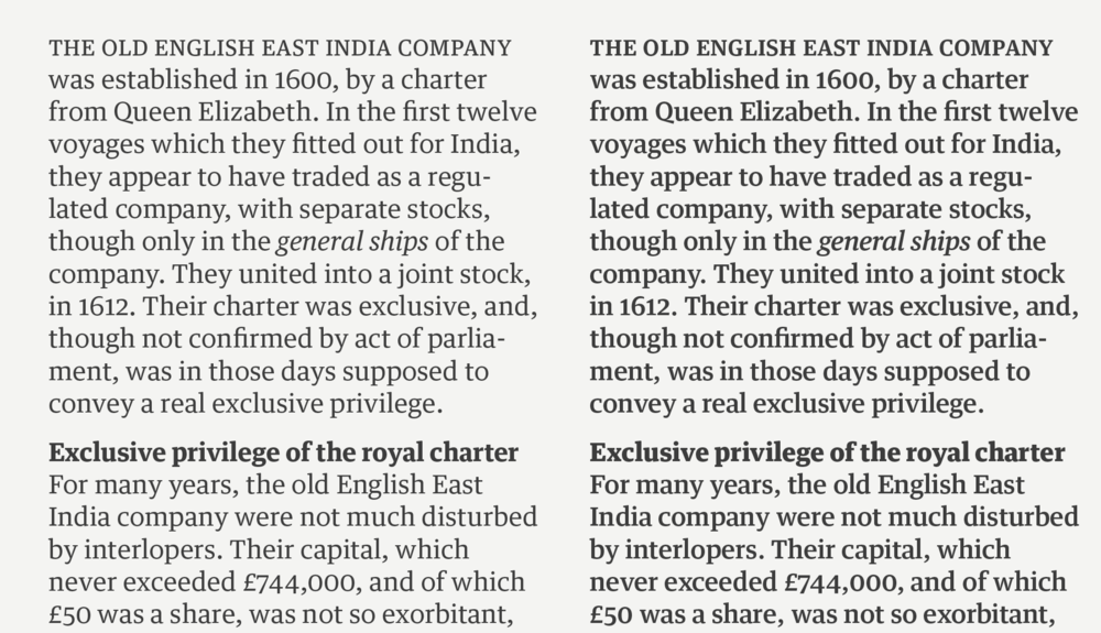
The Regular and Bold in each grade of the Agate are available in two versions: one where the Bold is wider than the Regular, as is typical; and a version where all characters are drawn on the same set of widths, so text can be switched on the fly from Regular to Bold without any reflow, perfect for stock listings, classified ads, or buttons in an interface.
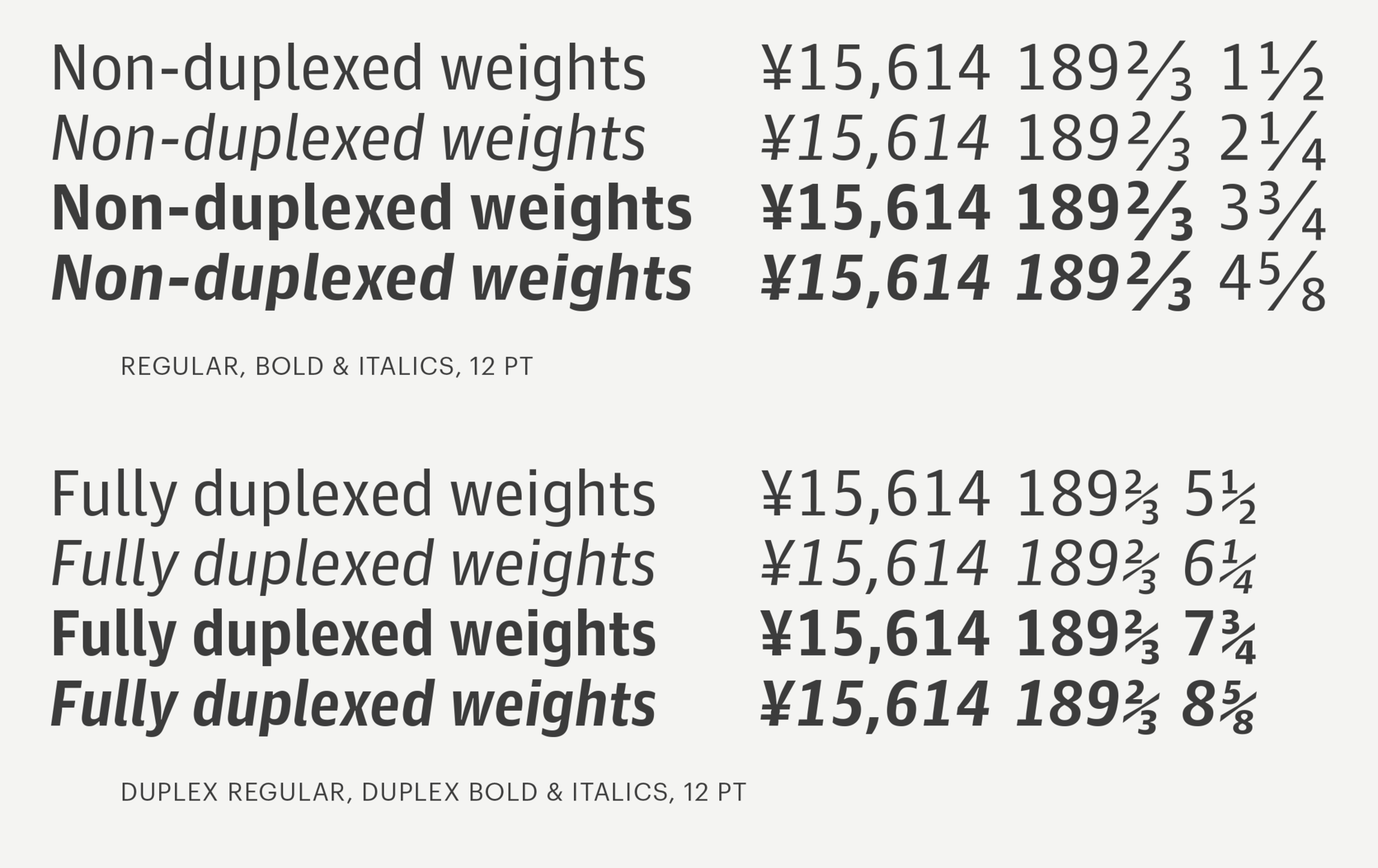
 Duplexing forces all characters in all weights onto the same set of widths, so text does not change length at all when changing weight.
A collection of 25 pieces of text have been assigned default formatting and placement, each with a scroll bar to change the weight of that section. The layout is replicated in a 4x4 matrix to allow wrapping as the user drags the layout around, to produce the effect of an infinite newspaper page. The text is culled from various old editions of the New York Times, all from August 22 in various years between 1920 and 1960. Articles have been transcribed verbatim; headlines have been paraphrased.