BACK TO START
LYON TEXT
LYON DISPLAY
How this microsite works
LYON DISPLAY
How this microsite works
Lyon
One of our first releases, book and type designer Kai Bernau's Lyon is a contemporary interpretation of Robert Granjon’s seminal serif typefaces from the 16th century. This family brings Bernau’s fresh point of view to classical Renaissance forms.
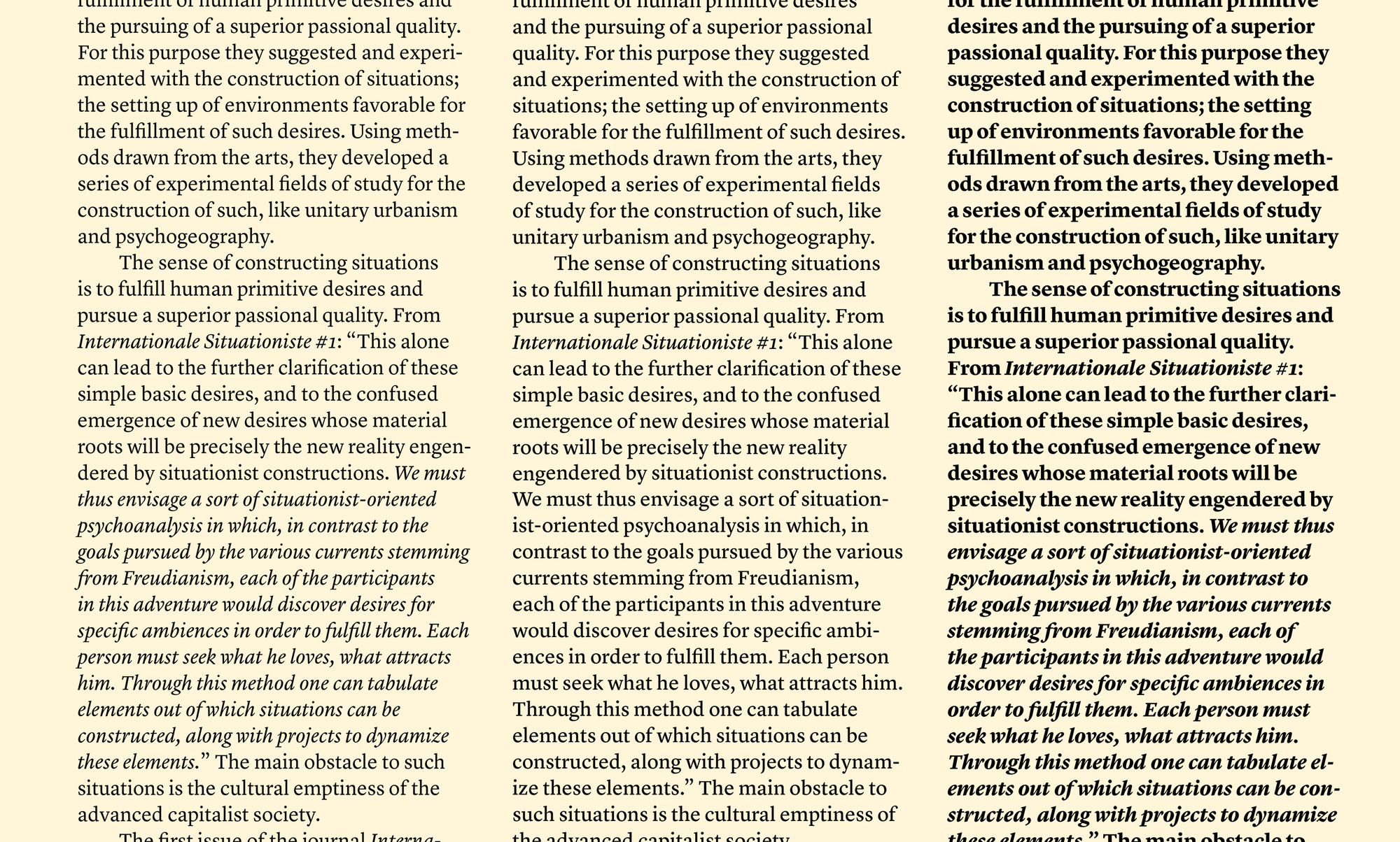
Lyon Text Roman was the centerpiece of Kai Bernau’s degree project at the Type + Media course at the Royal Academy of Art (KABK) in The Hague, but was extensively revised and expanded before its debut in the New York Times Magazine in 2009. It draws intelligently from the work of Robert Granjon, the master of the Renaissance, while having a contemporary feel. Its elegant looks are matched with an intelligent, anonymous nature, making it excellent for magazines, book and newspapers.
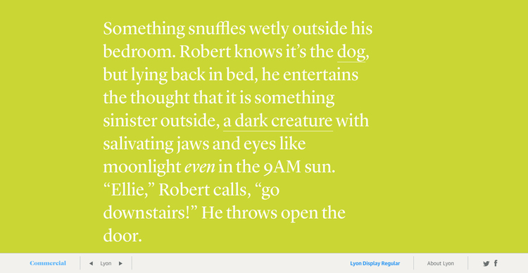
On screen, Lyon has a warm and inviting tone. The simplicity of its forms means that it renders well even in standard resolution, and its openness and low contrast makes it comfortable for reading even down at 11 and 12px. Because it is an oldstyle typeface designed with book typography in mind, it has quite a different feeling from a serif text face like Georgia, which has roots in British newspaper types of the 18th and 19th centuries.
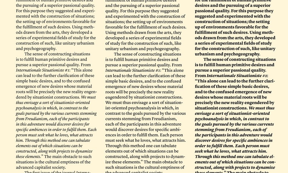 Lyon Text Regular and Regular No 2 give a choice between a more even or more assertive texture in text.
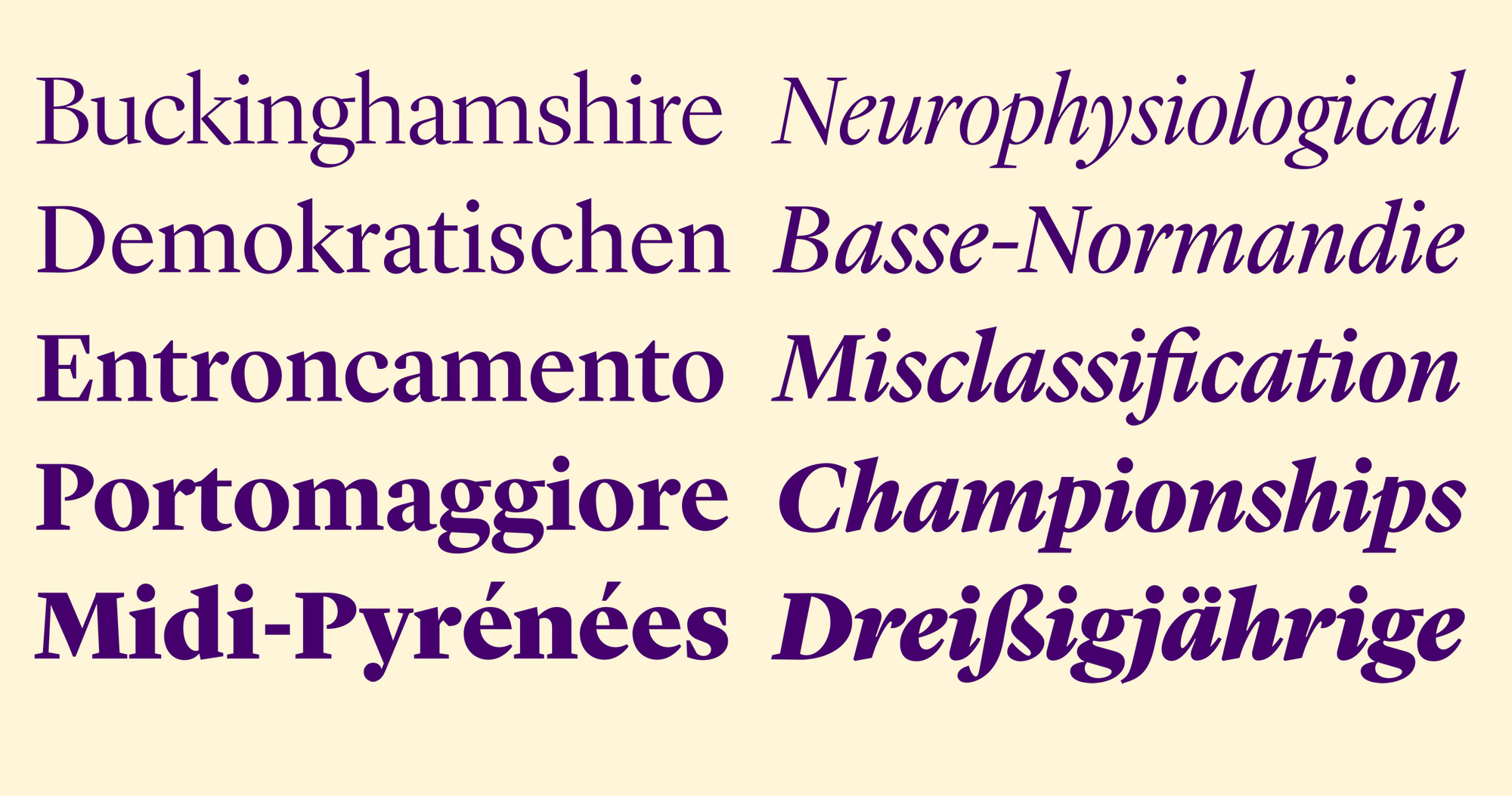
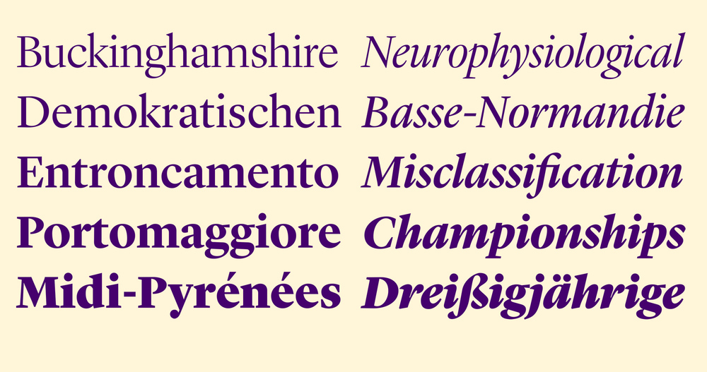
Lyon Display has the large x-height and short ascenders and descenders of a contemporary display face. Though it has higher contrast than Lyon Text, it follows Oldstyle convention in not exaggerating the contrast. Lyon Display sharpens some aspects of Lyon Text, such as the serifs, while softening others, including the hard corners on the ball terminals and the the lowercase g, and the incoming strokes in the italic lowercase. It is an excellent companion for Lyon Text, and also works well to bring life to layouts dominated by sans serif text.
 All five weights of the Lyon Display italics include a small selection of swash characters, available by request in the webfonts.
How this microsite works:
Writer Kat JK Lee wrote a non-linear story with links in each section to other sections that allow the user to explore different paths of the narrative. Each section is shown in a different weight and style of Lyon.
Writer Kat JK Lee wrote a non-linear story with links in each section to other sections that allow the user to explore different paths of the narrative. Each section is shown in a different weight and style of Lyon.