How this microsite works
Platform
Platform was the first typeface released by Berton Hasebe. At heart, this family is an exploration of how the geometric sans serif – some of the most well-explored territory of 20th century type design – can be approached in a contemporary context. Platform is also an exercise in craft, as Berton was curious to experiment with the idea of crude forms which are well-crafted.
Rather than aiming for perfection, Platform instead plays with the inherent crudeness in letters that have been reduced to their simplest essence. Platform drew inspiration from a wide variety of geometric sans serifs from around the world, including the quirky Latin alphabets designed to match Japanese typefaces, which informed the large x-height. In upper and lowercase, Platform's distinctive proportions make it the kind of typeface that adds a lot of visual interest to a simple layout. Despite its distinctiveness, Platform is quite flexible, and has worked well across all levels of visual cuture, from highbrow art institutions to high street fashion.
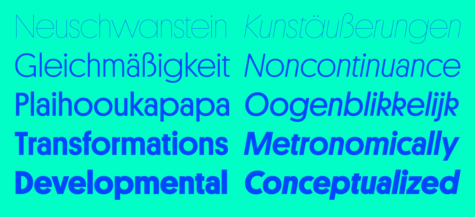
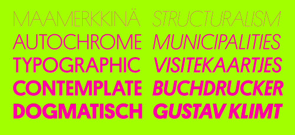
 Platform covers a wide range of weight in just five steps. The alternates can be included in the web version by request.
Platform also takes influence from the strangely-proportioned early Modernist German and Dutch sans serifs, which informed the interplay between wide and narrow forms in the uppercase, yielding a unique texture in lines of caps. Where the lowercase is casual and inviting, the uppercase has a more sophisticated edge.
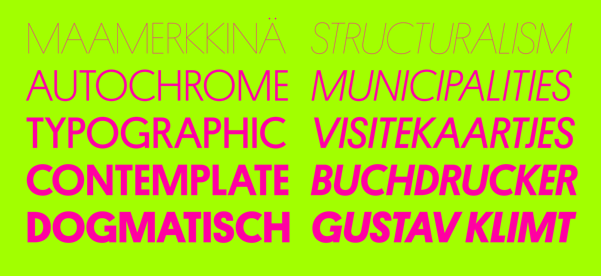
 In all caps, the width differences between round and flat letters, in essence an exaggerated rendition of classic Roman inscriptional proportions, give a distinctive feel.
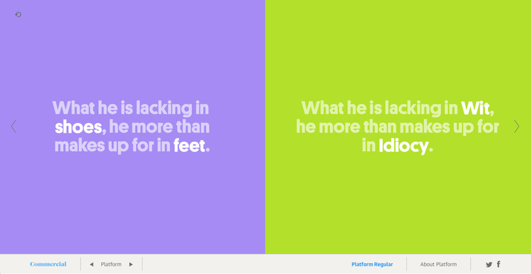
Writer Kat Lee assembled the text, each with two blanks to be filled. When the user submits their choice, the data is stored and the user-generated content is displayed at random in the gallery.