PORTRAIT TEXT
PORTAIT CONDENSED
PORTRAIT INLINE
How this microsite works
Portrait
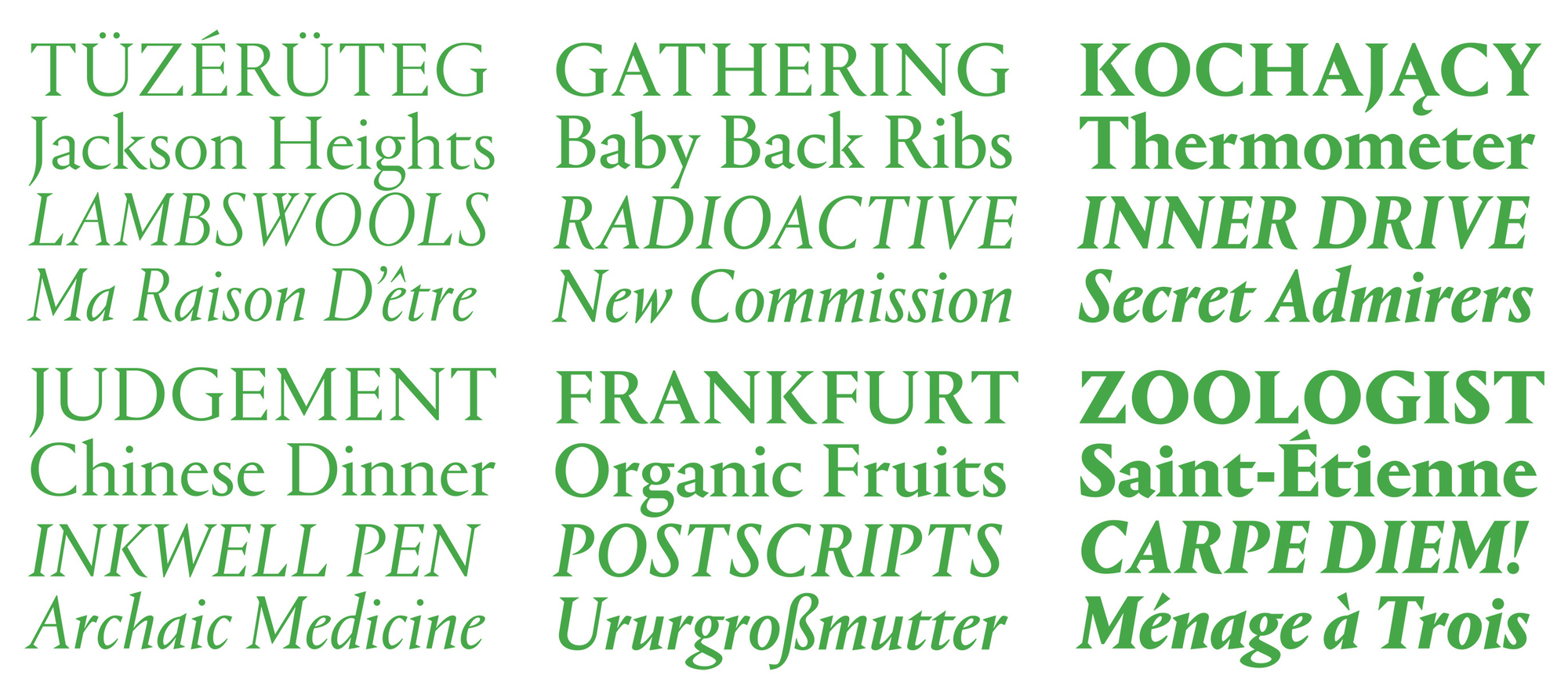
Portrait is Berton Hasebe’s sharply minimalist depiction of French Renaissance types. The marriage of classical proportions with triangular Latin serifs is an inspired combination, and a fresh way to see these nearly 500-year-old forms. Portrait draws its primary inspiration from the Two-line Double Pica Roman (equivalent to 32pt in today’s sizes) cut by French punchcutter Maître Constantin around 1530 for the printer Robert Estienne. Portrait replaces the delicately modeled serif treatments of Constantin’s original with simple, triangular Latin serifs, reimagining the Renaissance forms in a contemporary light.
Portrait is unabashedly new, aggressive in its simplicity but nuanced in its details. The collection covers a wide range of tones from the sober beauty of the display face, to the warm sparkle of Portrait Text, to the exuberance of the Condensed and Inline.
The core of the Portrait collection is the display face, which feels airy and delicate in the lightest weight while feeling much more expressive, almost evocative of woodcuts, in the heaviest weights. Its small x-height sets it apart from most contemporary serif display faces and makes a strong statement about its connection to history. The italics strip away the cursive traits expected that French Renaissance italics are known for, leaving sharp and narrow forms with a glassy elegance.
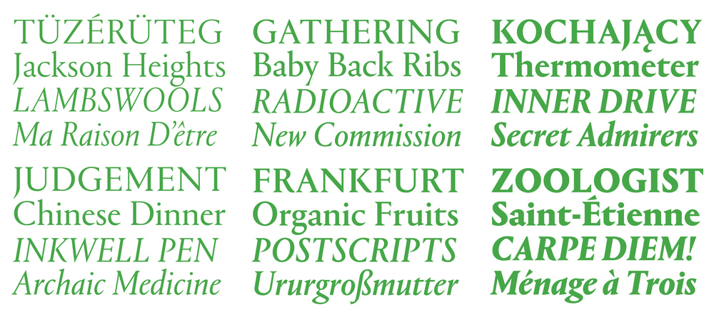 Portrait has six weights.
 The serif shapes have been stripped down to sharp and minimalist triangular forms.
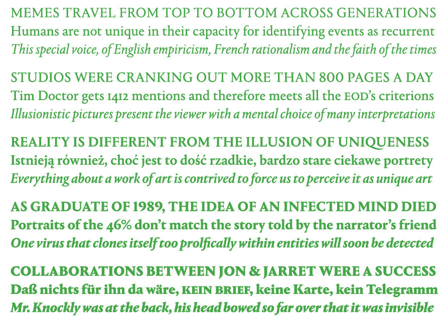
Portrait Text has a larger x-height, blunter details, and less contrast, so it naturally feels calmer than its display companion. The stripped-back simplicity of the Latin serifs gives Portrait a cleaner and sharper tone than a typical Renaissance oldstyle-influenced text face, At text sizes on screen, Portrait Text has a strong personality and a very active texture.

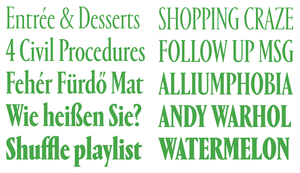
With few exceptions, condensed serif display faces are often timid and compromised versions of the serif faces they are based on, designed solely to save space rather than to add another kind of voice to the family. Portrait Condensed, on the other hand, emphatically embraces its narrow proportions. While it does offer better copyfit than Portrait, its efficiency is secondary to its personality.
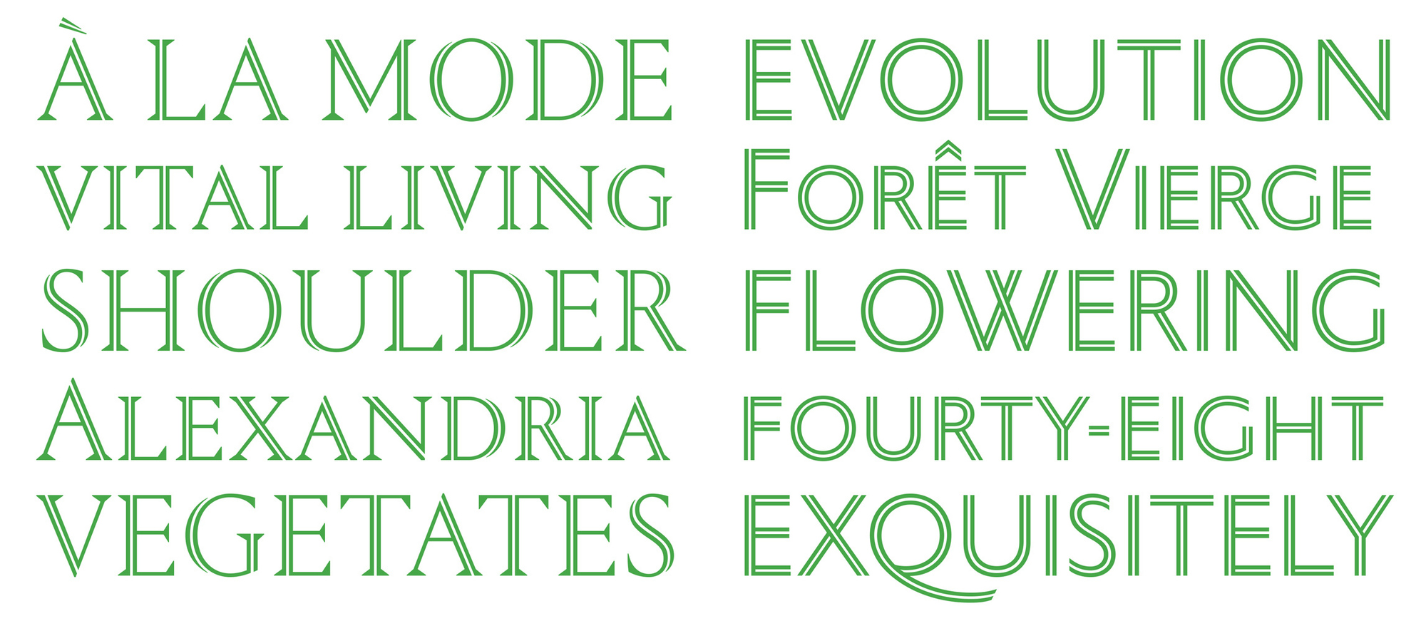
Portrait Inline is another display addition to the Portrait collection, building on the inscriptional proportions of the capitals. In the seriffed Regular, sharply tapering outer strokes play against monoline inner strokes, with all extraneous detailing stripped away. The Inline Sans exposes the geometric underpinnings of the proportions, while adding a dimensional element through its overlapping strokes. Even this family has been manually hinted, in hope that web designers will be able to take advantage of the possibilities it offers to do beautiful and unusual things.
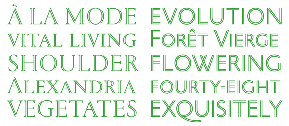
 Berton Hasebe used an early sketch for Portrait Inline in his contribution to the 50 and 50 project.
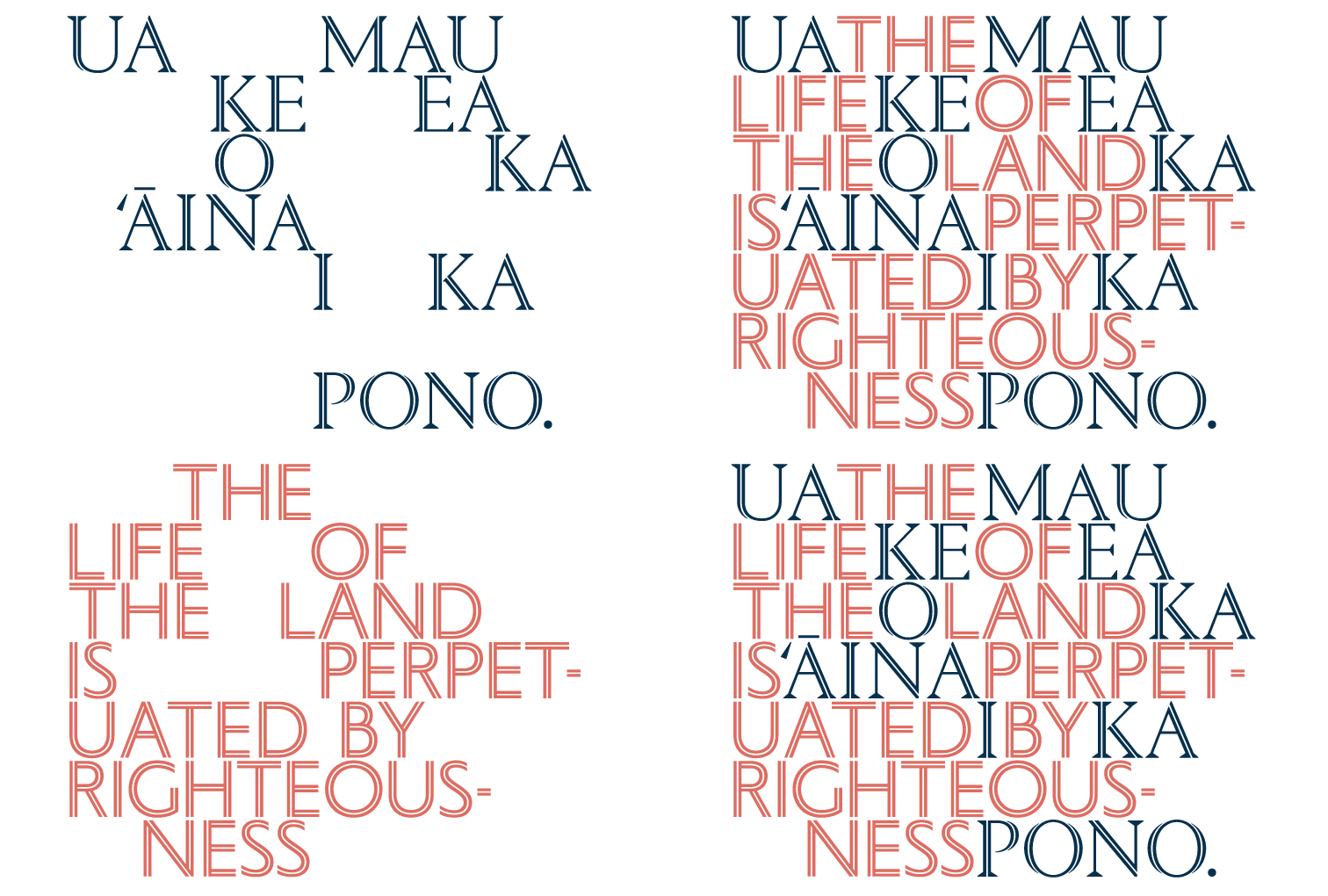
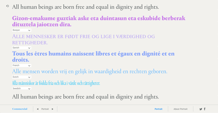
This is our multilingual version of the game “Telephone”. The initial text is processed by Google's Translate API, which detects the language and then translates it to the next language in the sequence. The result is fed back into the translation API for each subsequent language before being translated back to the original language. The styles have been carefully sequenced so the order will feel random; each time the translation chain is started, a random starting point is chosen from this sequence.

