PUBLICO BANNER
PUBLICO TEXT
PUBLICO TEXT MONO
How this microsite works
Publico
Drawn by Paul Barnes and Christian Schwartz, assisted by Kai Bernau, Publico originated as one of many stops on the long road to the 2005 redesign of The Guardian. It was later finished for Mark Porter and Simon Esterson’s redesign of the Portuguese-langauge daily Público in Lisbon. Because Publico and Guardian share an underlying skeleton, they make ideal companions.
For those interested in reading in detail how this family came about as part of the Guardian redesign project, and how the serif face that became Publico also served as a starting point for Guardian Egyptian, the entire story is documented in Francesco Franchi's excellent book Designing News.
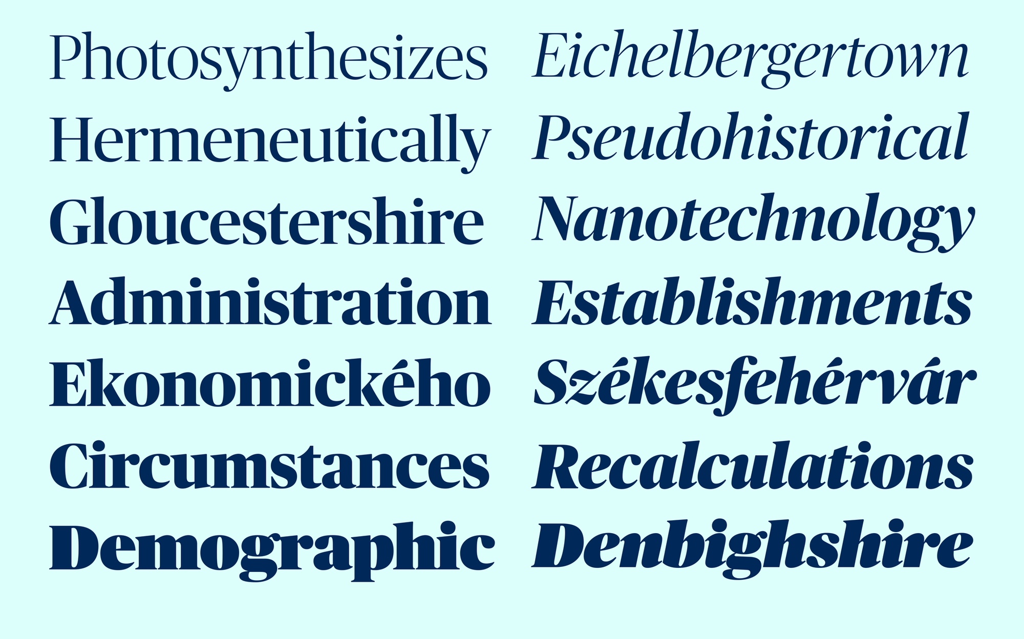
Publico Headline exhibits a balanced interplay between sharp serifs and soft ball terminals. Its lack of fussy details gives the face a clean, contemporary look and a quiet elegance, and the wide range of weights allows it to bring a variety of tones to the page. Publico combines the open counterforms and Dutch-influenced structure seen in Guardian Egyptian with a similar approach to serif shape and contrast to the newspaper text typefaces produced by the Miller & Richard Typefoundry in Edinburgh in the mid-19th century. This heritage is most visible in the Headline size.
The medium contrast of Publico Headline, not as sharp as Publico Banner but more elegant than Publico Text, is well suited to use on screen.
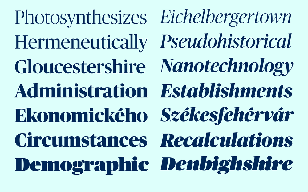
 The six weights of Publico Headline range from a Light weight appropriate for features to heavier weights suited to news.
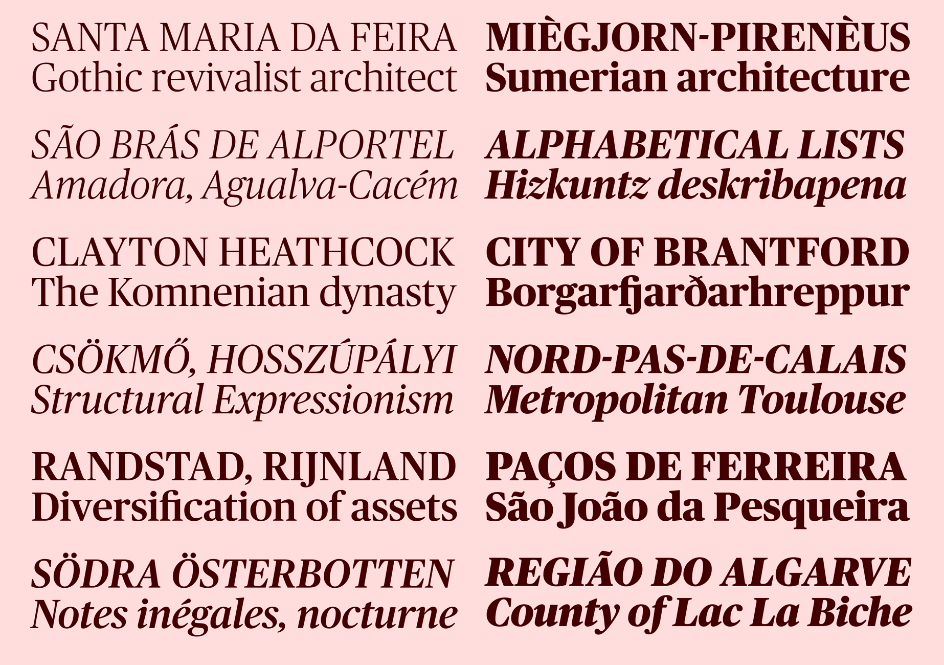
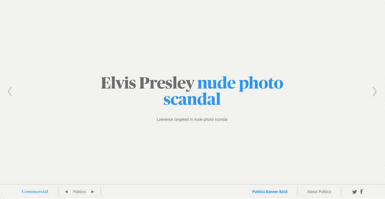
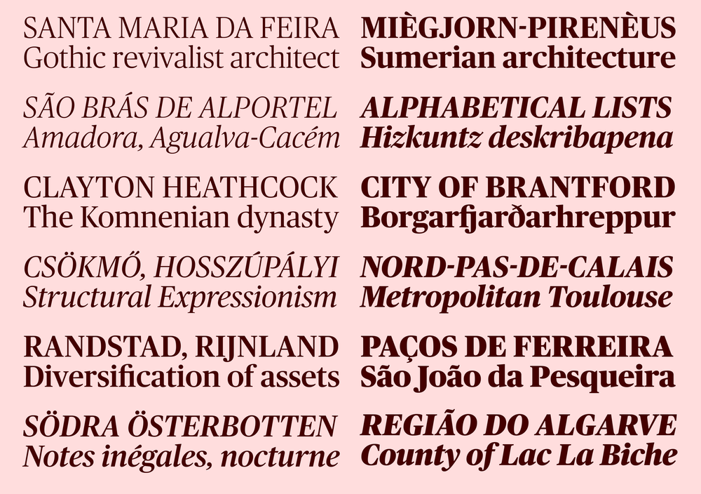
Publico Banner, drawn with Ross Milne, was designed to meet the needs of those magazine designers who prefer sharper features in enormous display type. This family exaggerates the contrast between thick and thin and the interplay between sharp and soft forms, and is intended for use at 60 point and above, where its sharp and delicate serifs can fully be appreciated. The Ultra weight is a loving homage to Herb Lubalin, Tony Stan, Ed Benguiat, Tom Carnase, and others from their generation of lettering artists and type designers. It brings a sense of fun to an otherwise sober fmaily.
 The high contrast of Publico Banner allows it to encompass both lighter and heavier weights than Publico Headline.
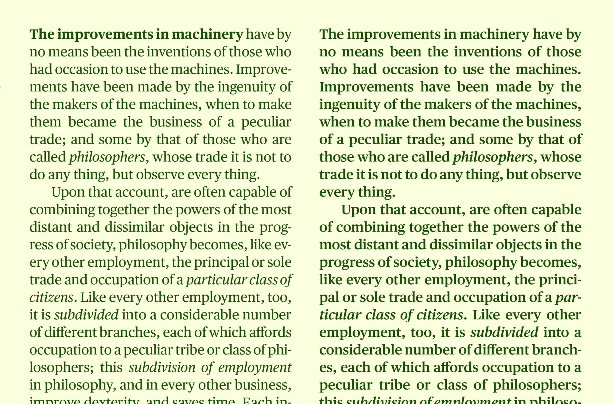
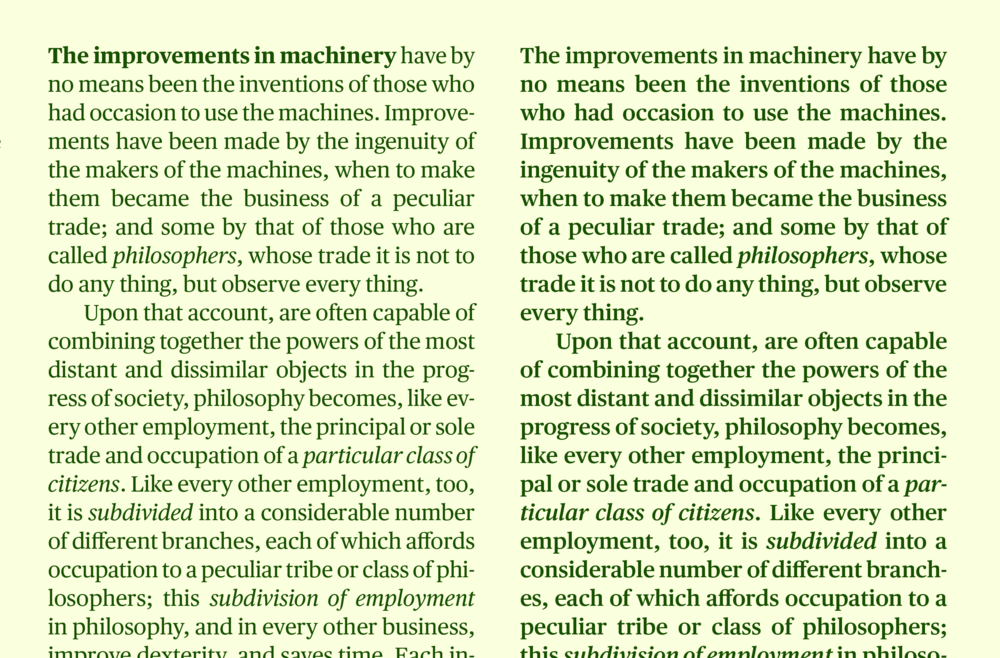
The narrow proportion of Publico Text makes for efficient text settings, but the squareness of its forms and its overall openness keep the face from looking squeezed. Rather than the refined elegance seen in the Headline, Publico Text is characterized by sturdiness in the serifs and less pronounced ball terminals, making for an even, comfortable texture. Newspaper text faces make excellent text faces for screen usage, and Publico Text is no exception.
 Publico Text is composed of three weights with matching italics.
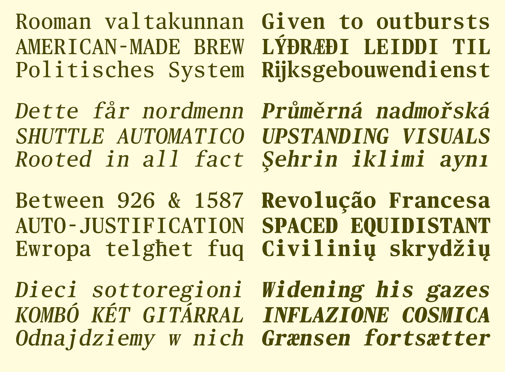
Richard Turley commissioned a monospaced sans for Bloomberg Businessweek’s 2012 election issue, with the aim of using it to make data look like data, untouched by human hands. Commercial Type had moved into an office in Chinatown in New York earlier that year; Christian Schwartz had noticed monospaced serif type on many signs in the neighborhood, set in Latin alphabets that look as though they are almost an afterthought in Chinese typefaces. Inspired by these awkwardly beguiling un-designed forms, he decided to draw a monospaced version of Publico Text as well.
Publico Text Mono feels at once familiar and alien—recognizable as Publico, but with a distinctly strange texture. Greg Gadzowicz added the italics in 2014. In keeping with the un-designed aesthetic, the italics are optically corrected obliques. The typeface can be used for data, but its strange personality also makes it an excellent fit for a particular kind of ‘arty’ graphic and web design.
 Narrow characters like I i j and l reduce the overall density of words, and make Publico Text Mono Roman feel lighter than its proportionally spaced equivalent , so we have added Roman No. 2, a stronger weight that better approximates the overall color of the Roman weight in Publico Text.
Headlines are retrieved from CNN's RSS feeds of US, Showbiz, Living, Top Stories, Health, Travel, Latest and Tech stories. The feeds are parsed using Google's Feed API, the headlines then split in approximate halves (by word count). Random first halves are then spliced with random second halves to generate new headlines that usually still make an unnerving semblance of sense.