How this microsite works
Stag
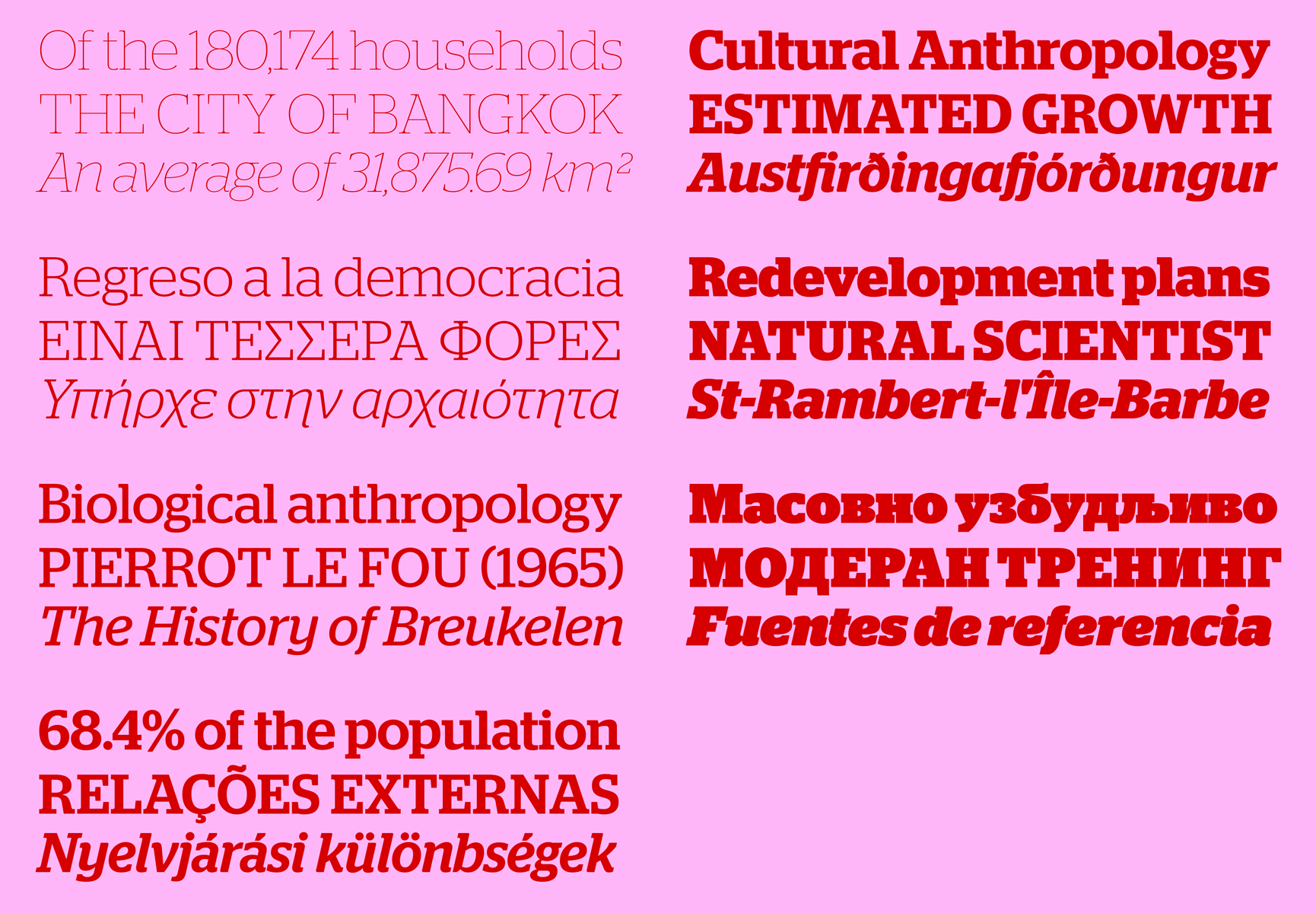
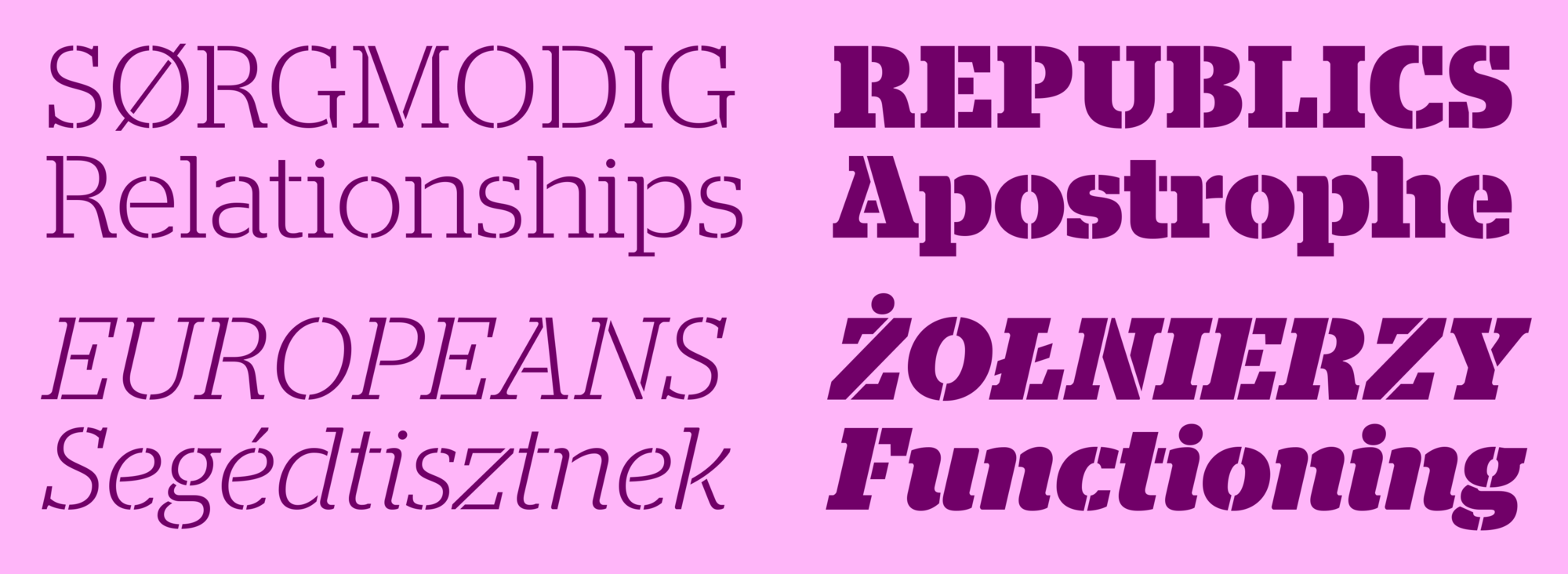
Designed by Christian Schwartz and commissioned by David Curcurito and Darhil Crooks, Stag started in 2005 as a small, muscular family of slab serifs intended to be used for display typography in the US edition of Esquire magazine. Subsequent years saw the magazine’s need for additional variations on the same basic theme eventually turn this small family into a sprawling and somewhat eccentric collection. The entire collection shares a certain feeling of masculinity, tempered by a warm and friendly tone which has been introduced by a large x-height and the subtle rounding off of some of the hard corners.
Stag mixes the contemporary taste for large x-heights and quirky details with influences from continental Egyptians of the early twentieth century. With more overt personality than a more sober family like Guardian Egyptian, Stag is perfect for situations that need a little more distinction in typographic dress.
 Stag's seven weights cover the extremes as well as utilitarian styles in between.
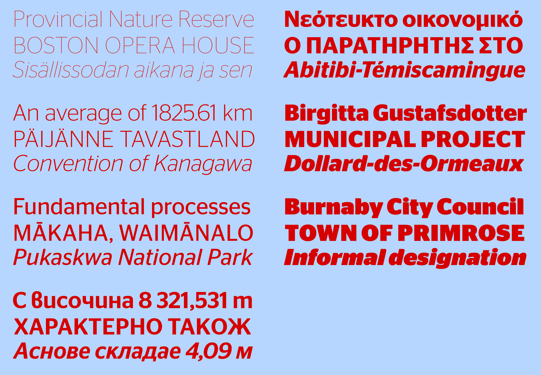
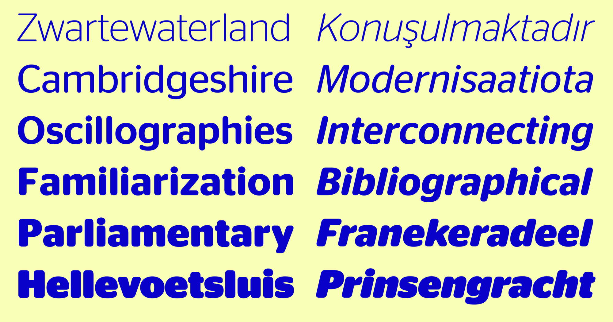
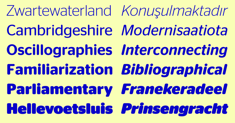
Stag is characterized by many distinctive details, so the trick in designing a companion sans was to pinpoint the right balance between the rounded terminals, which connect it to the original Stag, and the blunt terminals, which give the family a no-nonsense muscularity. The end result is a sans that is interesting in headlines but not distracting at text sizes. Stag’s open counterforms, designed originally to faciliate heavy, blocky terminals, adapted well to readability at more normal weights in the sans.
 Stag Sans has the same weight range as Stag.
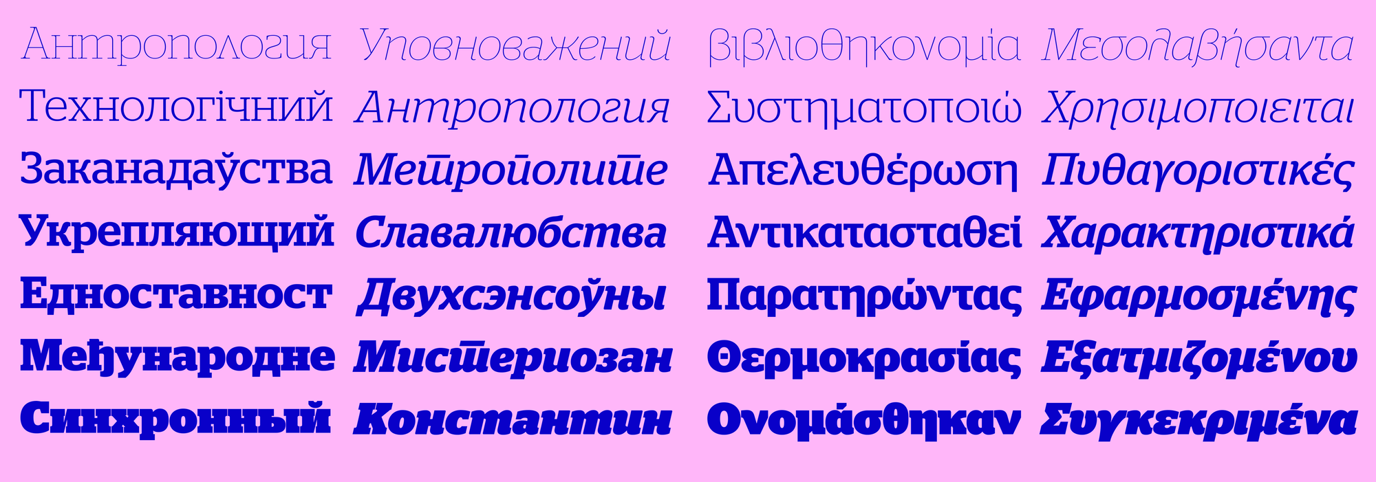
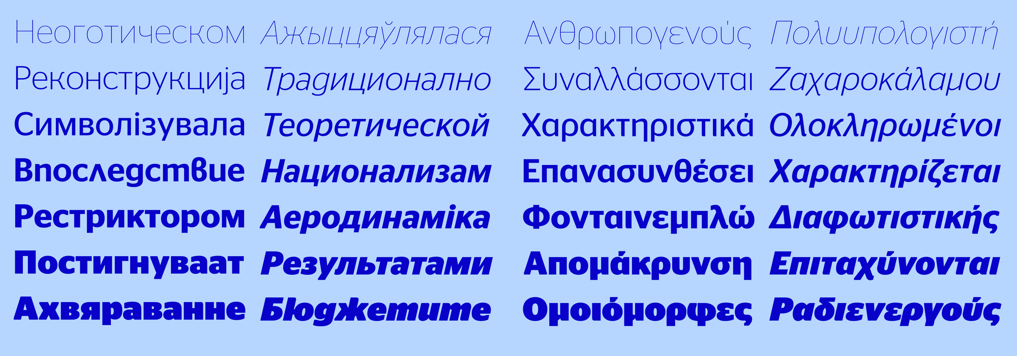
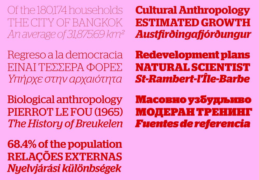
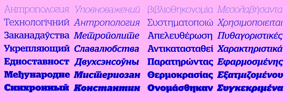
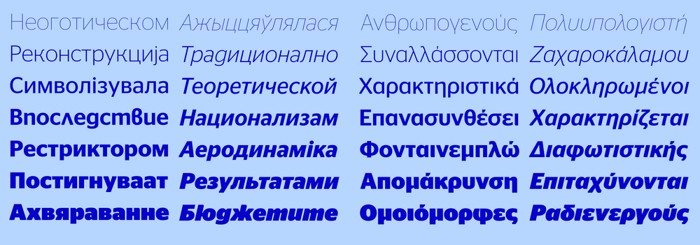
In 2014, Commercial Type commissioned Greek and Cyrillic versions of the Stag and Stag Sans families. The Cyrillics were designed by Ilya Ruderman, a mutlitalented type designer, news designer, and information graphics specialist based in Moscow. The Greeks were drawn by Panos Haratzopoulos, principal of the Cannibal Typefoundry outside Athens.
Stag Stencil, drawn by Berton Hasebe with Schwartz, takes the masculinity of the original slab serif to almost comical extremes by making the implicit “constructedness” of the characters explicit. Although it was a relatively late addition to the family, it seemed to be a natural fit. Stag Stencil differs from most existing stencil faces because the original slab serif has is no clear basis in geometry, so many of the the stencil components end up being unusual organic forms, leading to especially interesting solutions in the italics.
 The italics show the odd, organic quality of Stag Stencil best.
Stag Sans Round adapts the blunt terminal forms seen in the original sans into slight swelling in terminals, giving this family an organic quality unusual for a rounded sans. Care has been taken to keep the heaviest weights from becoming too cartoonishly obese. Instead, they temper the softness and retain their power. Ross Milne deftly navigated the compromises necessary to make Stag Sans Round work on its own organic terms as more than simply a programatically rounded version of the sans. We recommend using Stag Sans Round at 18px and above online, where the roundness of the terminals looks intentional.
 Stag Sans Round skips the Thin weight, because the strokes simply weren't thick enough for the rounding to be visible.
Coming up with contemporary ways to make decorated type can be a real challenge, but in the case of Stag Dot, the main idea was to keep it simple. Commissioned for Las Vegas Weekly, these two variants on the original slab version of Stag capture the unique spirit of Las Vegas. The two weights use very different approaches to the idea of building type out of dots: the Bold follows a strict grid, while the Thin faithfully traces the contours of Stag Thin.
The complexity of the shapes makes it difficult to get Stag Dot to work on the web. The files are slow to download and extremely slow to render. Screen rendering is optimized for an 'o' being made up of two outlines, not 50, as in Stag Dot Thin—or in the case of Stag Dot Bold, 295. Stag Dot Thin is available for web use upon request, but Stag Dot Bold is as yet unavailable.
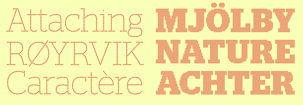 The complexity of Stag Dot is wonderful in print, but difficult to manage on screen for a multitiude of reasons. On a standard resolution screen, the image above likely displays an unpleasant moiré pattern in Stag Dot Bold.
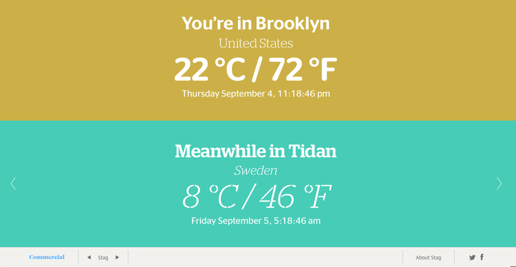
Every half hour, temperature data is cached for a set of 40 cities selected at random from a list of around 80,000 of the world's most populous cities. The user's location is determined from their IP address using the MaxMind GeoLite database [link]. The GeoLite database has limited accuracy, so Stag might sometimes tell you you're in Anchorage when in fact you're in Key West. Each location is styled with a random assortment of styles from the Stag collection, with the time always being set in Stag Sans because its web version fetures tabular figures by default. The background color corresponds to the temperature.